-
Notifications
You must be signed in to change notification settings - Fork 10
Tutorial expVIP Graphical Interface (Wheat Expression Browser example)
This tutorial is based on the Wheat Expression Browser. However, the principles are the same for any transcriptome study which is powered by the expVIP graphical interface.
#Home Page #
The home page allows the user to insert a gene name to search and to define which studies are to be included in the visualisation interface. By default all studies are selected, but users can select/deselect a study by simply clicking on the specific button.
You can also compare expression between two genes by introducing both gene names in the boxes and pressing the Compare button.
Alternatively you can compare expression across multiple genes (up to 50) to generate a heatmap. You can add a list of genes separate by commas or one gene per line in the Multiple genes box.
All gene names are based on the transcriptome reference used for expVIP: for the case of the Wheat Expression Browser we used the IWGSC transcriptome available through Ensembl Plants release 26.
Once the gene expression loads the page includes several features. These are shown below and explained point by point:
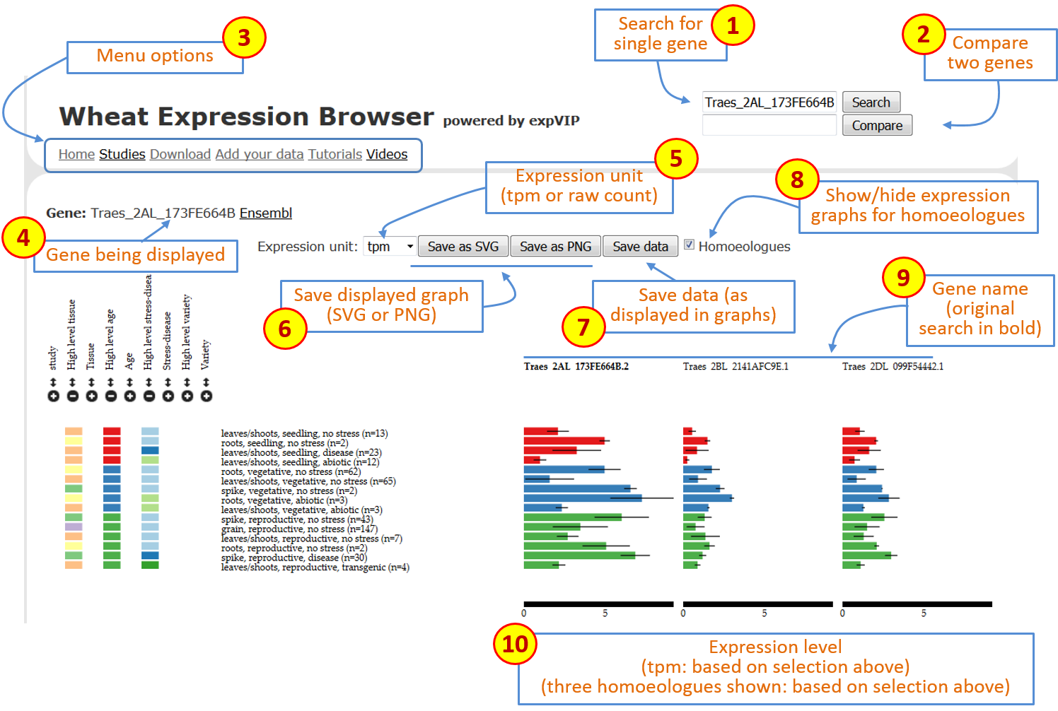 Figure 1: Overall description of features on Wheat Expression Browser
-
Search box: at any point you can type or copy a new gene name (based on Ensembl Plants nomenclature) and generate a new set of expression data. -
Compare box: you can type a second gene name and press theComparebutton to generate two expression graphs drawn at the same scale. -
Menu options: this includes a series of links to different options:
-
Home: return tohomescreen. -
Studies: opens up a popup screen with a summary and short description of each study and a link to manuscript. -
Download: link to download all the wheat expression database includingtpmandcountsand associated metadata. -
Add your data: link to GitHub to download virtual machine. -
Tutorials: link to Wheat Expression Browser Tutorial. -
Videos: link to Wheat Expression Browser Video Tutorial.
-
Gene: shows the gene which is currently being displayed with link to Ensembl Plants gene page. -
Expression unit: allows user to select the expression unit used to visualise the expression data. This can be either “transcript per million (tpm)” or “estimated counts (counts)”. We have not provided RPKM given the inconsistencies generated across samples when using this measure. A detailed discussion can be found in Wagner et al (2012). It is important to mention thattpmis preferred over RPKM since it allows an easier comparison for abundances between samples. However it is important to stress that whiletpmserves as a relative measure to compare genes across experiments, a proper normalisation and statistical analysis with differential gene expression programs must be performed.expVIPgenerates outputs which allow easy implementation ofsleuth,DESeqandEdgeR. -
Save graph: these two buttons allow users to save the current graphs in eitherSVG(to work on Adobe Ilustrator) or asPNGfiles. The graphical file will render based on the current selection and order of factors as displayed on the screen. -
Save data: this allows the user to download acsvfile with the data based on the current selection and order of factors as displayed on the screen. The data will include the standard errors and the number of samples that make up each value. -
Homoeologues: by clicking on this button, theWheat Expression Browserwill display the expression graphs of known homoeologues of the original primary gene. This gene name will remain in bold and the homoeologous graphs will be displayed according to A, B, D genome ordering. When homoeologues are displayed the same expression scale is used across graphs and the sorting and filtering of factors is simultaneous to allow easier comparison. -
Gene names: gene name for corresponding graph. When homoeologues are shown the original gene used for the search is shown in bold. -
Expression level: the expression level adjusts according to the expression of each set of gene homoeologues. The scale remains consistent across homoeologues to allow easier comparison. The values are based on the unit selected in theexpression unitbox (see point 5 above).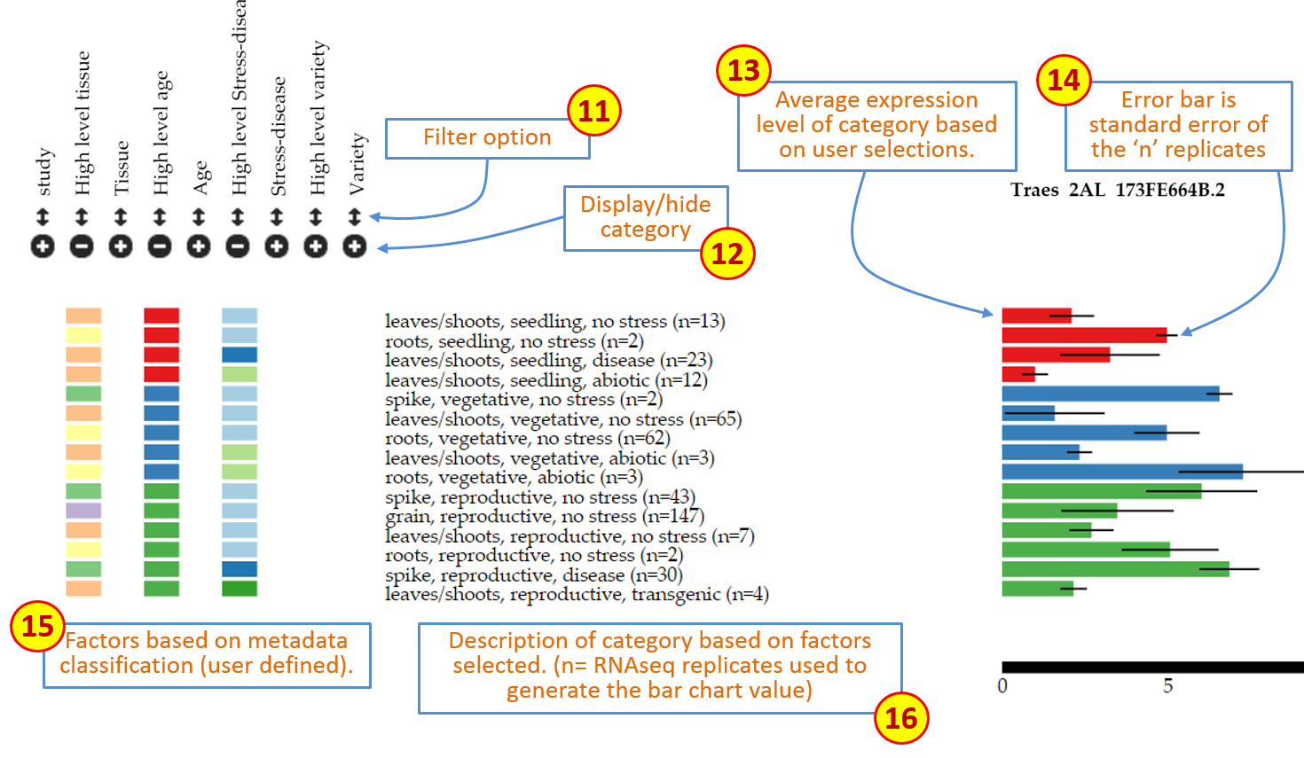 Figure 2: Overall description of features on Wheat Expression Browser (continued)
 -
Filter: This feature open a pop-up window which reveals all the levels within the particular category. All levels are pre-selected, but users can choose to display specific levels by selecting or deselecting them accordingly. If a level is deselected, then the data associated with this factor is removed from the graph. Within the pop-up window levels can also be re-arranged according to the user’s preference by dragging the level to the specific position within the pop-up window (see Features section below). -
Display/hide category: Each individual category can be displayed or hidden by pressing the+/-button. When a category is displayed, the expression graphs will re-arrange according to the new category which has been introduced. If a category is hidden, then the graphs will also adjust accordingly. Data is not removed when doing this, rather it is grouped within the categories selected such that the total samples displayed remains the same. The colours within the category correspond to unique values or levels (up to 24 different colours) and are also used in the bar graphs corresponding to the expression data. -
Expression bars: These bars represent the expression level of the “n” samples which are grouped according to the factors chosen based on the selection criteria (11 and 12 above). When hovering over the bar with the mouse a small tooltip will indicate the expression level (tpmorcounts) and the standard error (sem) used for the error bars (see 14) -
Error bars: Standard error of the means for the “n” expression values on which the bar graph is based. -
Factors: Coloured rectangles represent the categories which are displayed according to the factors chosen based on the selection criteria (11 and 12 above). When hovering above the rectangles a tooltip will appear to show the long name of the level being examined. -
Description: Text description of the factors chosen based on the selection criteria (11 and 12 above) and the number of RNAseq samples (n) which meet this specific criterion. -
Expression unit: For heatmaps, log2(tpm) is suggested as the expression unit as this provides better resolution to compare multiple genes across several categories. -
Heatmap: Expression data is represented as a heatmap. As for single genes, categories can be sorted and filtered using the same tools. Gene names appear on the top of each column. Currently, up to 50 genes can be visualised in one heatmap. In Figure 3, for example, the two right-most genes are expressed solely in grains, with one being expressed to higher levels as suggested by the dark blue colour. -
Scale: Colour scale for the expression values in the heatmap. The values adjust according to the highest tpm value being displayed within the current heatmap visualisation. Since tpm values below 2 are considered as very low expressed genes and log2 values of tpm<1 result in negative expression values, we forced tpm values below 1 to have a log2 value of cero (i.e. log2(<1)=0).
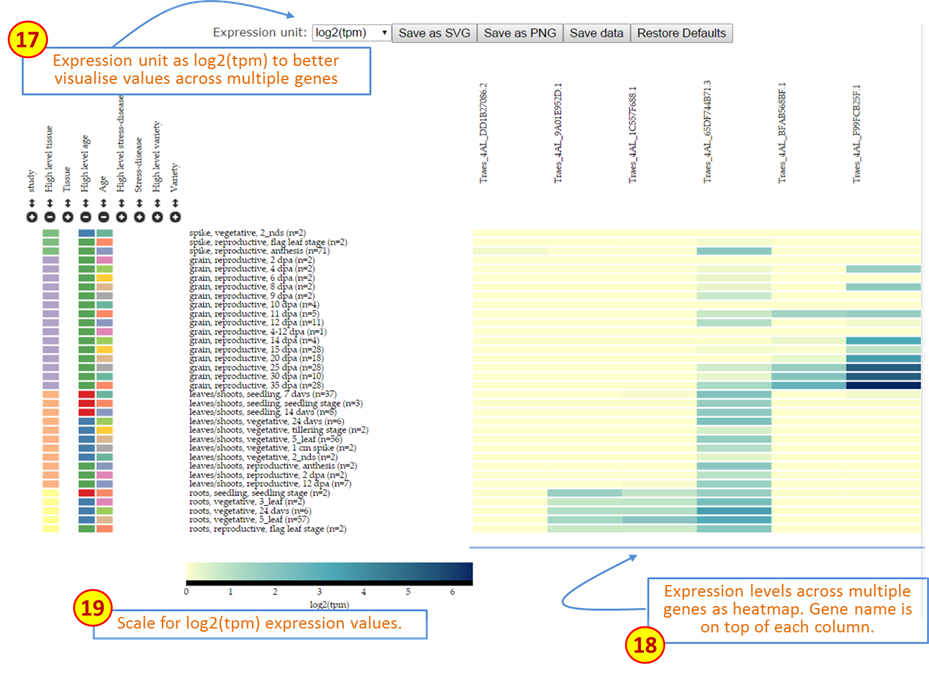 Figure 3: Description of features on Wheat Expression Browser using Multiple gene comparisons.
Factors can be sorted within each category in two ways.
- The first is by simply clicking the mouse on top of the coloured rectangles underneath the heading. For example in Figure 2 samples are sorted on
High level agefromseedling(red),vegetative(blue) toreproductive(green). If the user clicks on any of the coloured rectangles in theHigh level tissuecategory, then the graph is automatically reorganised based on this factor. In this case it includes four categories as defined by the user in the metadata and the bar graphs on the right hand side change colour according to the latest factor used for sorting. The previous factor used (in this casehigh level age) remains as a secondary sorting factor (Figure 3).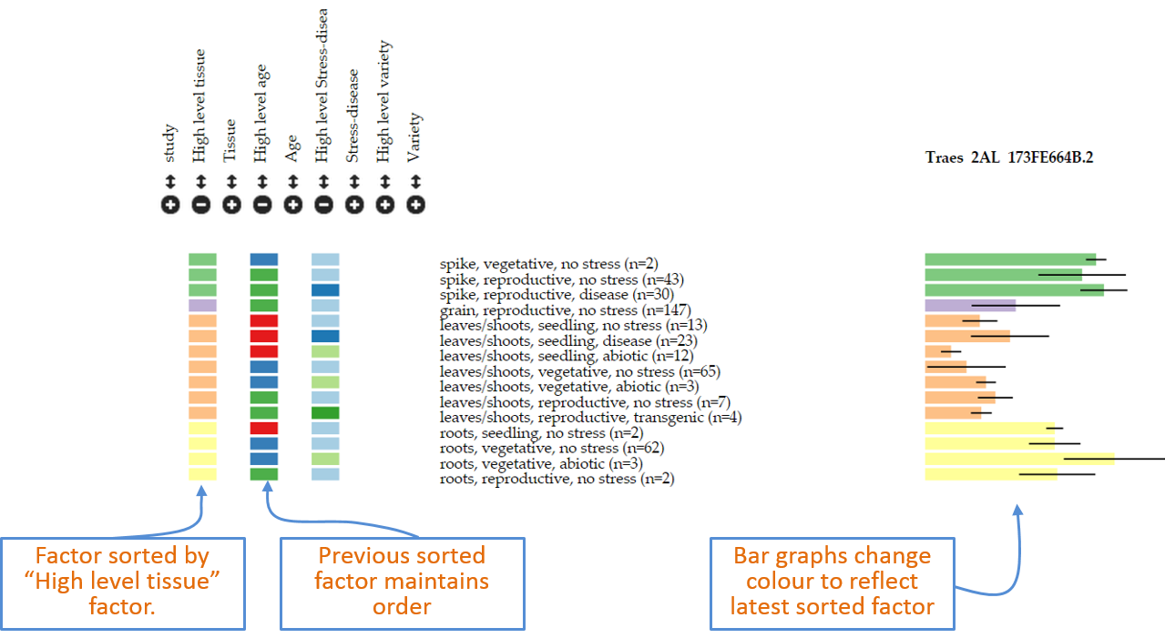 Figure 4: Example of new sorting of data based on clicking of rectangles within “high level tissue”.
 - Alternatively, the user can define the exact order of factors within the browser interface. To do so the
filteroption (point 11 above) can be used. By clicking on the double arrow button the user opens a pop-up window which shows the levels within the factor. In this example by pressing the double-arrow underneathhigh level tissuea pop-up with four levels appears based on the order as determined in the user defined metadata (spike,grain,leaves/shoots,roots). To rearrange this, the user can simply click, hold and drag the level to the desired position. This will automatically re-arrange the data based on the new order and the corresponding graph and legends will follow suit. The bottom panel of Figure 5 shows a new order ofroots,leaves/shoots,spikeandgrain.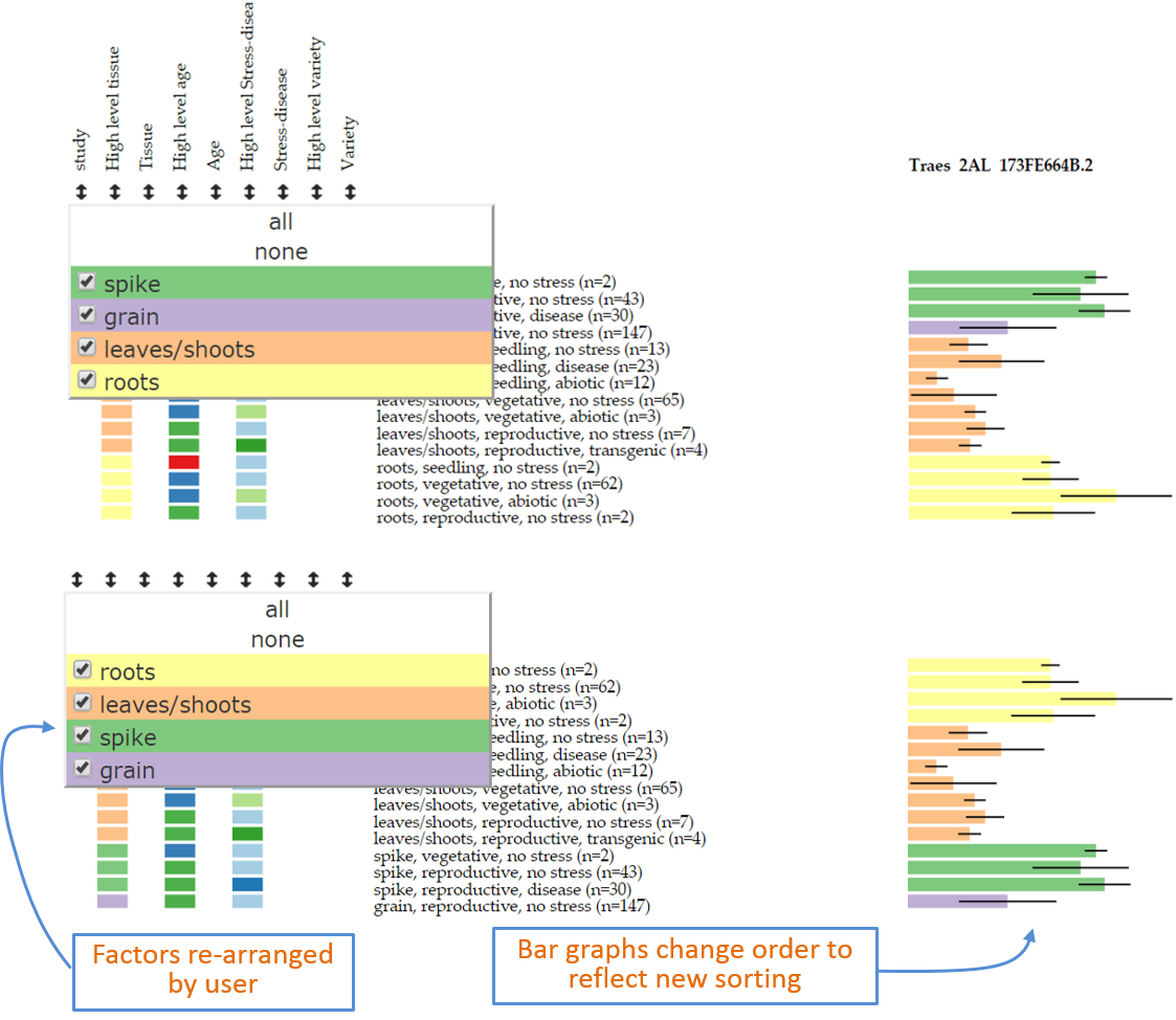 Figure 5: Example of sorting of data based on new user defined order within the filter pop-up window.
In cases it may be required to remove certain samples from the visualisation. Note that displaying or hiding a category (point 12 above) does not remove the underlying data from the visualisation: this just simply groups the data within the selected category. Therefore to remove samples from the visualisation the user can open the filter pop-up as described for the Sorting option. Individual levels within the category can then be removed by using the “check-box” on the left hand side of the level name. By de-selecting a given level (in the example for Figure 6 we have deselected leaves/shoots and spike), samples defined as such will be removed from the analysis and will not be shown in the bar graphs. In Figure 6 now only two levels remain (roots and grains) and hence the bar graphs only show these two levels. Notice that the numbers of samples which comprise each bar graph are the same as those on Figure 5. The pop-up window also includes an all and none option to rapidly select/deselect individual samples. The filtering option can be used on any factor: for example to remove a complete study from the analysis the easiest way is to select the study filtering pop-up on the far left and deselect the study in question.
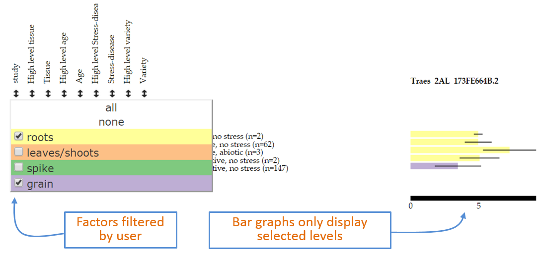 Figure 6: Example of filtering data based on user defined selection within the filter pop-up window.