Interactive Differential Expression Analysis Tool
If you are using DEBrowser in your research, please cite:
Alper Kucukural, Onur Yuksel, Deniz M. Ozata, Melissa J. Moore, Manuel Garber, DEBrowser: Interactive Differential Expression Analysis and Visualization Tool for Count Data, BMC Genomics 2019, 20:6 doi: 10.1186/s12864-018-5362-x
Differential expression (DE) analysis has become an increasingly popular tool in determining and viewing up and/or down expressed genes between two sets of samples. The goal of differential gene expression analysis is to find genes or transcripts whose difference in expression, when accounting for the variance within condition, is higher than expected by chance. DESeq2 is an R package available via Bioconductor and is designed to normalize count data from high-throughput sequencing assays such as RNA-Seq and test for differential expression (Love et al. 2014). With multiple parameters such as padjust values, log fold changes, plot styles, and so on, altering plots created with your DE data can be a hassle as well as time consuming. The Differential Expression Browser uses DESeq2 (Love et al., 2014), EdgeR (Robinson et al., 2010), and Limma (Ritchie et al., 2015) coupled with shiny (Chang, W. et al., 2016) to produce real-time changes within your plot queries and allows for interactive browsing of your DE results. In addition to DE analysis, DEBrowser also offers a variety of other plots and analysis tools to help visualize your data even further.
DEBrowser utilizes Shiny, a R based application development tool that creates a wonderful interactive user interface (UI) combined with all of the computing prowess of R. After the user has selected the data to analyze and has used the shiny UI to run DE analysis, the results are then input to DEBrowser. DEBrowser manipulates your results in a way that allows for interactive plotting by which changing padj or fold change limits also changes the displayed graph(s). For more details about these plots and tables, please visit our quick start guide for some helpful tutorials.
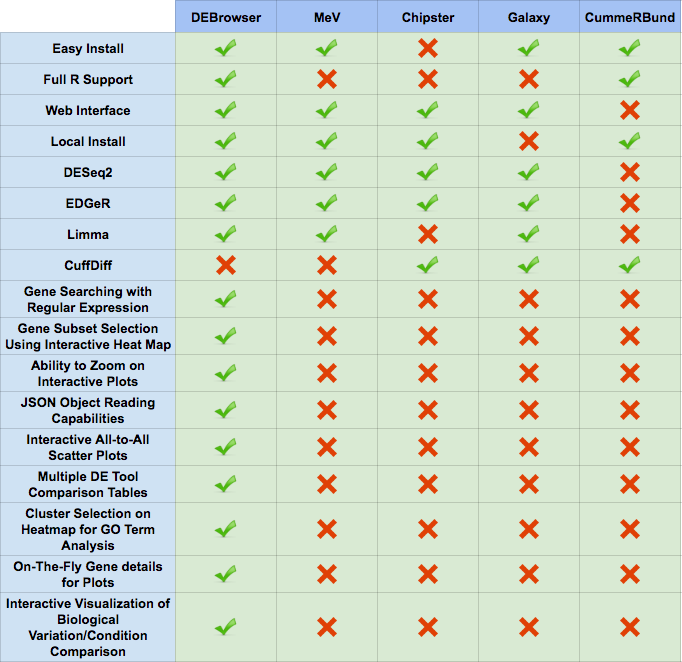
For comparisons against other popular data visualization tools, see the comparison table below (Figure 40).
Before you start; you will have to install R and/or RStudio.
# Installation instructions:
# 1. Install DEBrowser and its dependencies by running the lines below
# in R or RStudio.

if (!requireNamespace("BiocManager", quietly=TRUE))
    install.packages("BiocManager")
BiocManager::install("debrowser")

# 2. Load the library

library(debrowser)

# 3. Start DEBrowser

startDEBrowser()
Please check Operating System Dependencies section, in case your operating system requires packages to be installed.
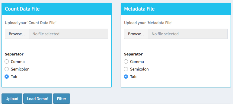
Once you've made your way to the website, or you have a local instance of DEBrowser running, you will be greeted with data loading section:
To begin the analysis, you need to upload your count data file (comma or semicolon separated (CSV), and tab separated (TSV) format) to be analyzed and choose appropriate separator for the file (comma, semicolon or tab).
Gene quantifications table can be obtained running standard software like HTSeq (Anders,S. et al, 2014) or RSEM (Li and Dewey, 2011). The file values must contain the gene, transcript(s), and the sample raw count values you wish to enter into DEBrowser.
If you do not have a dataset to upload, you can use the built in demo data file by clicking on the 'Load Demo (Vernia et al.)!' button. To view the entire demo data file, you can download this demo set: https://umms.dolphinnext.com/pub/debrowser/simple_demo.tsv . For another example, try our full dataset (Vernia et. al): https://umms.dolphinnext.com/pub/debrowser/advanced_demo.tsv .
The structure of the count data files are shown below:
| gene | transcript | exper_rep1 | exper_rep2 | control_rep1 | control_rep2 |
|---|---|---|---|---|---|
| DQ714826 | uc007tfl.1 | 0.00 | 0.00 | 0.00 | 0.00 |
| DQ551521 | uc008bml.1 | 0.00 | 0.00 | 0.00 | 0.00 |
| AK028549 | uc011wpi.1 | 2.00 | 1.29 | 0.00 | 0.00 |
Please also note that, DEBrowser reads the gene names from the first column and skips other non numerical columns and starts reading the quantification values from the 3rd column in this case.
In addition to the count data file; you need to upload metadata file to correct for batch effects or any other normalizing conditions you might want to address that might be within your results. To handle for these conditions, simply create a metadata file by using the example table at below or download sample file from following link: https://umms.dolphinnext.com/pub/debrowser/simple_demo_meta.txt
| sample | batch | condition |
|---|---|---|
| exper_rep1 | 1 | A |
| exper_rep2 | 2 | A |
| exper_rep3 | 1 | A |
| control_rep1 | 2 | B |
| control_rep2 | 1 | B |
| control_rep3 | 2 | B |
Metadata file can be formatted with comma, semicolon or tab separators similar to count data files. These files used to establish different batch effects for multiple conditions. You can have as many conditions as you may require, as long as all of the samples are present.
-
The example above would result in the first set of conditions as
exper_rep1,exper_rep2,exper_rep3fromAand second set of conditions ascontrol_rep1,control_rep2,control_rep3fromBas they correspond to those conditions in theconditioncolumn. -
In the same way, 'batch' would have the first set as
exper_rep1,exper_rep3,control_rep2from1and second set asexper_rep2,control_rep1,control_rep3from2as they correspond to those conditions in thebatchcolumn.
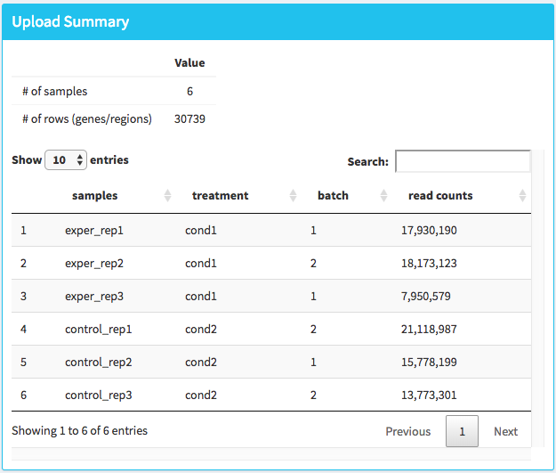
Once the count data and metadata files have been loaded in DEBrowser, you can click upload button to visualize your data as shown at below:
After loading the gene quantification file, and if specified the metadata file containing your batch correction fields, you then have the option to filter low counts and conduct batch effect correction prior to your analysis. Alternatively, you may skip these steps and directly continue with differential expression analysis or view quality control (QC) information of your dataset.
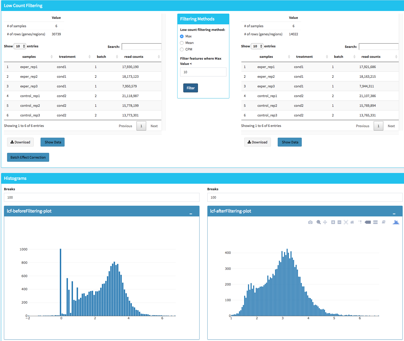
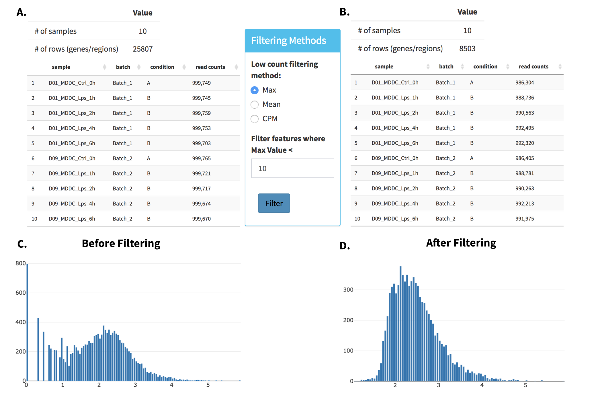
In this section, you can simultaneously visualize the changes of your dataset while filtering out the low count genes. Choose your filtration criteria from Filtering Methods box which is located just center of the screen. Three methods are available to be used:
- Max: Filters out genes where maximum count for each gene across all samples are less than defined threshold.
- Mean: Filters out genes where mean count for each gene are less than defined threshold.
- CPM: First, counts per million (CPM) is calculated as the raw counts divided by the library sizes and multiplied by one million. Then it filters out genes where at least defined number of samples is less than defined CPM threshold.
After selection of filtering methods and entering threshold value, you can proceed by clicking Filter button which is located just bottom part of the Filtering Methods box. On the right part of the screen, your filtered dataset will be visualized for comparison as shown at figure below.
You can easily compare following features, before and after filtering:
-
Number of genes/regions.
-
Read counts for each sample.
-
Overall histogram of the dataset.
-
gene/region vs samples data
-
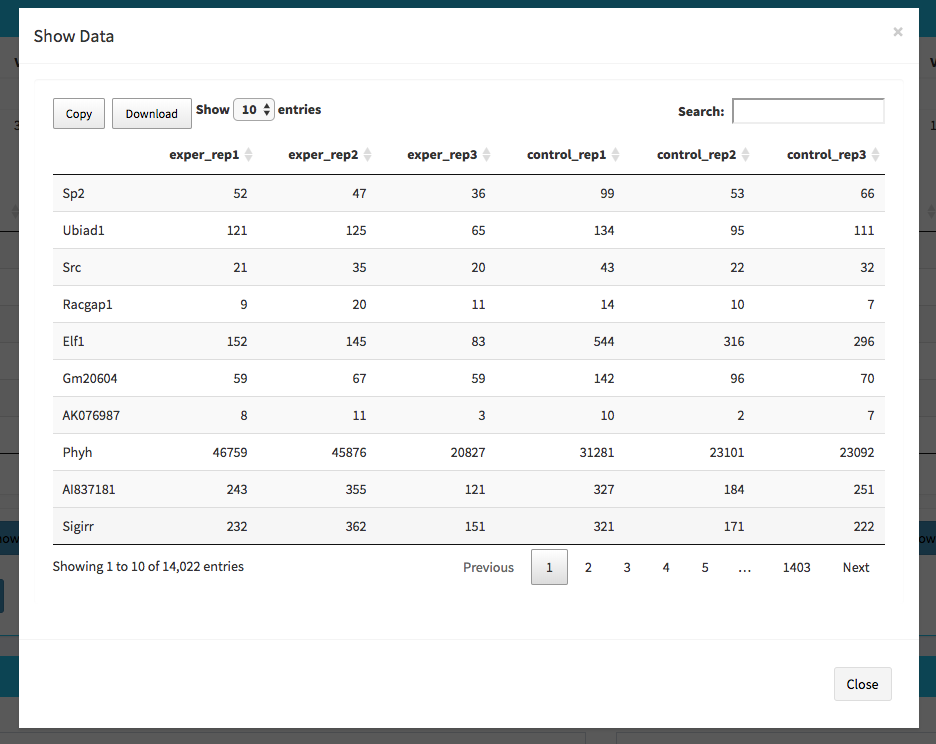
To investigate the gene/region vs samples data in detail as shown at below, you may click the Show Data button, located bottom part of the data tables. Alternatively, you may download all filtered data by clicking Download button which located next to Show Data button.
Afterwards, you may continue your analysis with Batch Effect Correction or directly jump to differential expression analysis or view quality control (QC) information of your dataset.
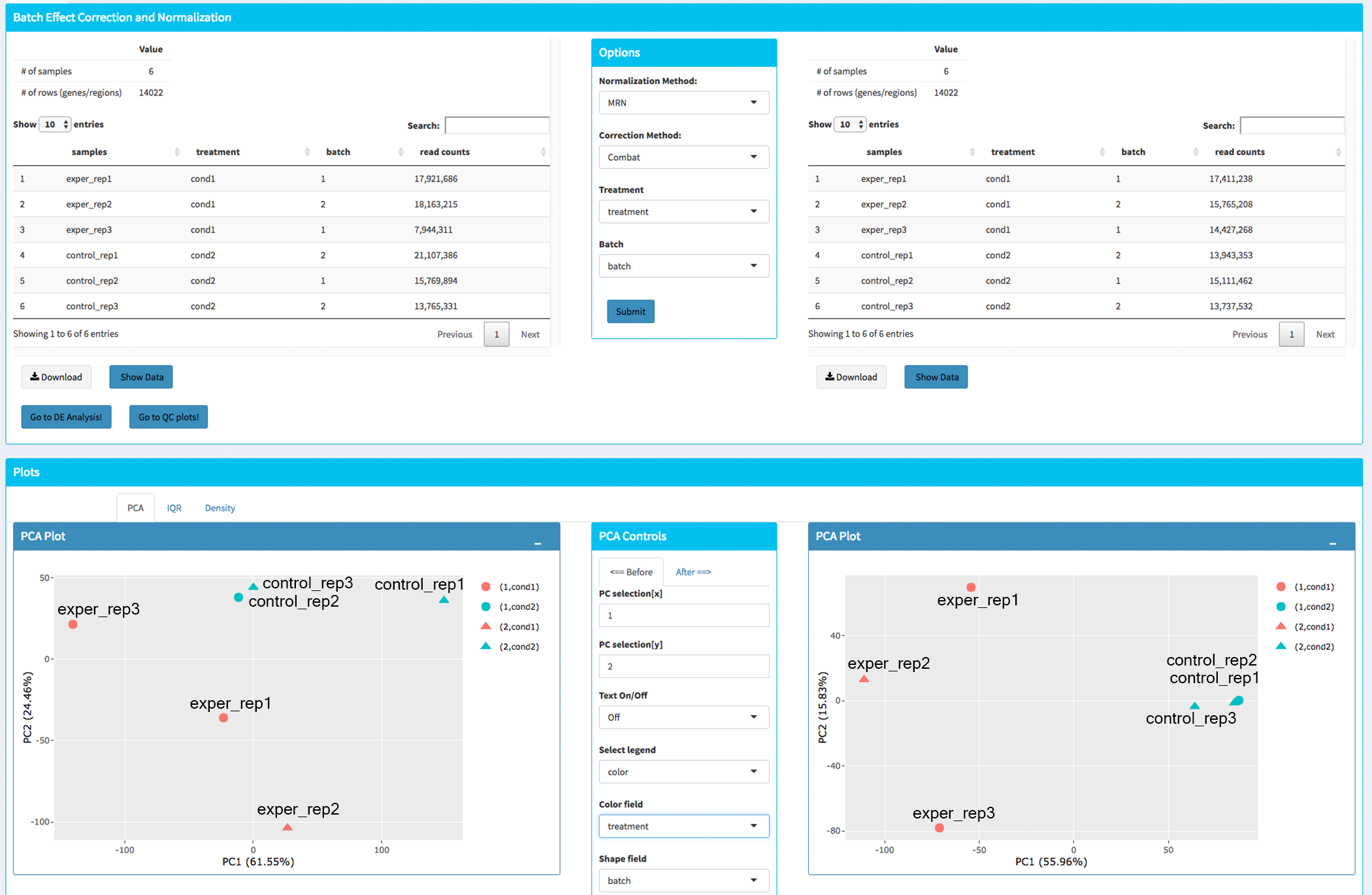
If specified metadata file containing your batch correction fields, then you have the option to conduct batch effect correction prior to your analysis. By adjusting parameters of Options box, you can investigate your character of your dataset. These parameters of the options box are explained as following:
- Normalization Method: DEBrowser allows performing normalization prior the batch effect correction. You may choose your normalization method (among MRN (Median Ratio Normalization), TMM (Trimmed Mean of M-values), RLE (Relative Log Expression) and upperquartile), or skip this step by choosing none for this item. For our sample data, we are going to choose MRN normalization.
- Correction Method: DEBrowser uses ComBat https://bioconductor.org/packages/release/bioc/vignettes/sva/inst/doc/sva.pdf (part of the SVA bioconductor package) or Harman https://www.bioconductor.org/packages/3.7/bioc/vignettes/Harman/inst/doc/IntroductionToHarman.html to adjust for possible batch effect or conditional biases. For more information, you can visit following links for documentation: ComBat https://bioconductor.org/packages/release/bioc/vignettes/sva/inst/doc/sva.pdf, Harman https://www.bioconductor.org/packages/3.7/bioc/vignettes/Harman/inst/doc/IntroductionToHarman.html For our sample data, Combat correction was selected.
- Treatment: Please select the column that is specified in metadata file for comparison, such as cancer vs control. It is named treatment for our sample metadata.
- Batch: Please select the column name in metadata file which differentiate the batches. For example, in our metadata, it is called batch.
Upon clicking submit button, comparison tables and plots will be created on the right part of the screen as shown below.
You can investigate the changes on the data by comparing following features:
-
Read counts for each sample.
-
PCA, IQR and Density plot of the dataset.
-
Gene/region vs samples data
-
You can investigate the gene/region vs samples data in detail by clicking the Show Data button, or download all corrected data by clicking Download button.
Since we have completed batch effect correction and normalization step, we can continue with one of the following options: 'Go to DE Analysis' and, 'Go to QC plots!'. First option takes you to page where differential expression analyses are conducted with DESeq2, EdgeR or Limma. The second option, 'Go to QC plots!', takes you to a page where you can view quality control metrics of your data by PCA, All2All, Heatmap, Density, and IQR plots.
The first option, 'Go to DE Analysis', takes you to the next step where differential expression analyses are conducted.
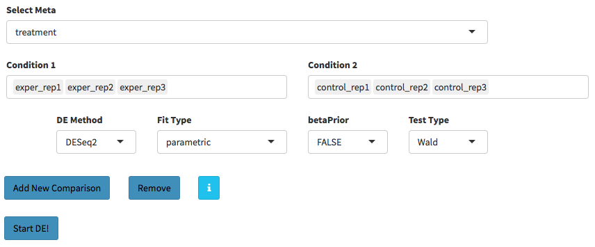
- Sample Selection: In order to run DE analysis, you first need to select the samples which will be compared. To do so, click on "Add New Comparison" button, and choose Select Meta box as treatment to simplify fill
Condition 1andCondition 2based on the treatment column of the metadata as shown below.
If you need to remove samples from a condition, simply select the sample you wish to remove and hit the delete/backspace key. In case, you need to add a sample to a condition you can click on one of the condition text boxes to bring up a list of samples and then click on the sample you wish to add from the list and it will be added to the textbox for that comparison.
-
You can add multiple conditions to compare by clicking on "Add New Comparison" button, and view the results separately after DE analysis.
-
Method Selection: Three DE methods are available for DEBrowser: DESeq2, EdgeR, and Limma. DESeq2 and EdgeR are designed to normalize count data from high-throughput sequencing assays such as RNA-Seq. On the other hand, Limma is a package to analyse of normalized or transformed data from microarray or RNA-Seq assays. We have selected DESeq2 for our test sample and showed the related results at below.
After clicking on the 'Submit!' button, DESeq2 will analyze your comparisons and store the results into separate data tables. It is important to note that the resulting data produced from DESeq is normalized. Upon finishing the DESeq analysis, a result table will appear which allows you to download the data by clicking "Download" button. To visualize the data with interactive plots please click on "Go to Main Plots!" button.
Upon finishing the DESeq analysis, please click on Go to Main Plots! button which will open Main Plots tab where you will be able to view the interactive plots.
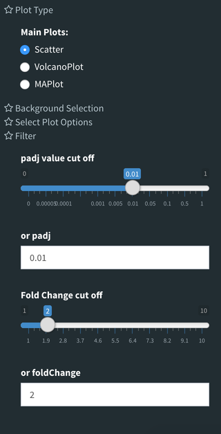
The page will load with Scatter Plot. You can switch to Volcano Plot and MA Plot by using Plot Type section at the left side of the menu. Since these plots are interactive, you can click to zoom button on the top of the graph and select the area you would like to zoom in by drawing a rectangle. Please see the plots at below:
A. Scatter plot, B. Volcano plot, C. MA plot
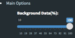
- Please keep in mind that to increase the performance of the generating graph, by default 10% of non-significant(NS) genes are used to generate plots. You might show all NS genes by please click Main Options button and change Background Data(%) to 100% on the left sidebar.
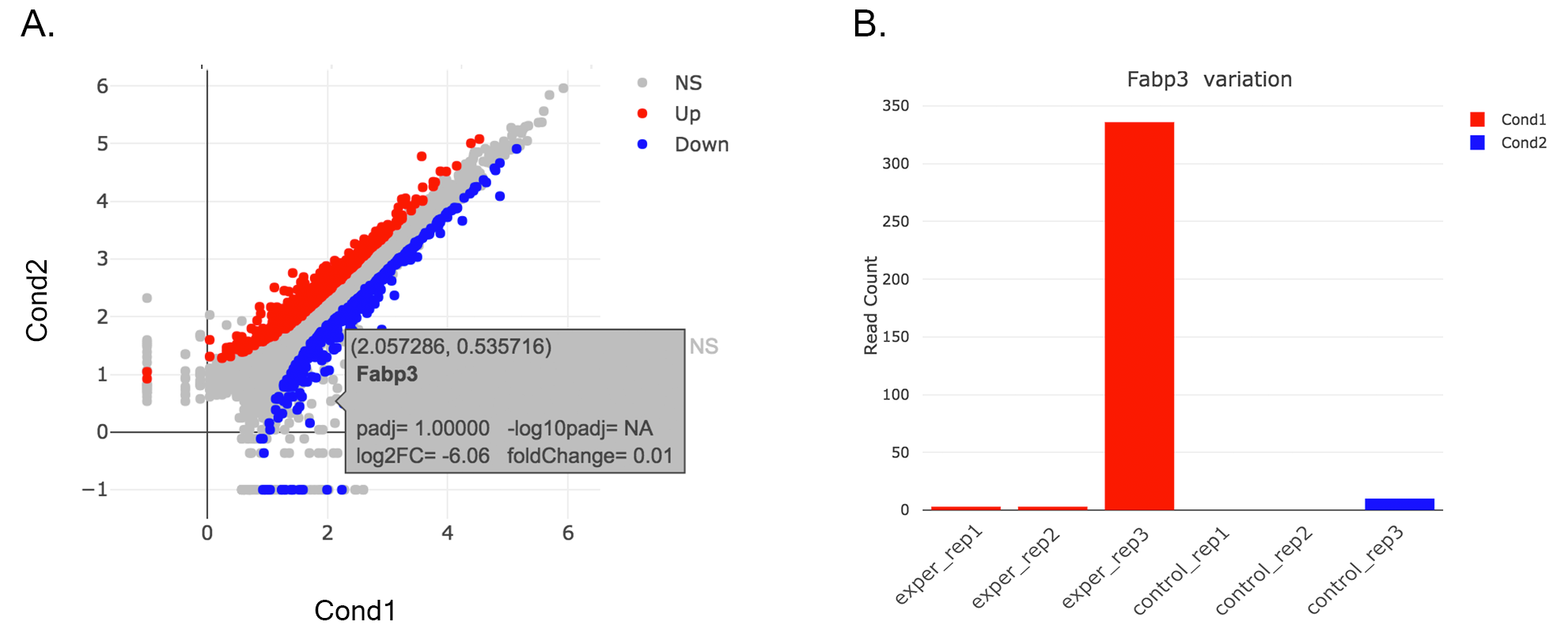
You can hover over the scatterplot points to display more information about the point selected. A few bargraphs will be generated for the user to view as soon as a scatterplot point is hovered over.
A. Hover on Fabp3 gene, B. Read Counts vs Samples, C. Read Counts vs Conditions
You also have a wide array of options when it comes to fold change cut-off levels, padj cut-off values, which comparison set to use, and dataset of genes to analyze.
- It is important to note that when conducting multiple comparisons, the comparisons are labeled based on the order that they are input. If you don't remember which samples are in your current comparison you can always view the samples in each condition at the top of the main plots.
After DE analysis, you can always download the results in CSV format by clicking the Download Data button located under the Data Options. You can also download the plot or graphs by clicking on the download button at top of each plot or graph.
For the details please check the user guide at this location: https://www.bioconductor.org/packages/release/bioc/vignettes/DESeq2/inst/doc/DESeq2.pdf
DESeq2 performs multiple steps in order to analyze the data you’ve provided for it. The first step is to indicate the condition that each column (experiment) in the table represent. You can group multiple samples into one condition column. DESeq2 will compute the probability that a gene is differentially expressed (DE) for ALL genes in the table. It outputs both a nominal and a multiple hypothesis corrected p-adjusted (padj) value using a negative binomial distribution.
DESeq2 requires count data as input obtained from RNA-Seq or another high-throughput sequencing experiment in the form of matrix values. Here we convert un-integer values to integer to be able to run DESeq2. The matrix values should be un-normalized, since DESeq2 model internally corrects for library size. So, transformed or normalized values such as counts scaled by library size should not be used as input. Please use edgeR or limma for normalized counts.
-
fitType: Either “parametric”, “local”, or “mean” for the type of fitting of dispersions to the mean intensity. See estimate Dispersions for description.
-
betaPrior: Whether or not to put a zero-mean normal prior on the non-intercept coefficients See nbinomWaldTest for description of the calculation of the beta prior. By default, the beta prior is used only for the Wald test, but can also be specified for the likelihood ratio test.
-
testType: Either “Wald” or “LRT”, which will then use either Wald significance tests (defined by nbinomWaldTest), or the likelihood ratio test on the difference in deviance between a full and reduced model formula (defined by nbinomLRT)
-
rowsum.filter: Regions/Genes/Isoforms with total count (across all samples) below this value will be filtered out
For the details please check the user guide at this location: https://www.bioconductor.org/packages/release/bioc/vignettes/edgeR/inst/doc/edgeRUsersGuide.pdf
-
Normalization: Calculate normalization factors to scale the raw library sizes. Values can be “TMM”, "RLE”, ”upperquartile”, or ”none”.
-
Dispersion: Either a numeric vector of dispersions or a character string indicating that dispersions should be taken from the data object.
-
testType: exactTest or glmLRT. exactTest: Computes p-values for differential abundance for each gene between two samples, conditioning on the total count for each gene. The counts in each group are assumed to follow a binomial distribution. glmLRT: Fits a negative binomial generalized log-linear model to the read counts for each gene and conducts genewise statistical tests.
-
rowsum.filter: Regions/Genes/Isoforms with total count (across all samples) below this value will be filtered out
For the details please check the user guide at this location: https://bioconductor.org/packages/release/bioc/vignettes/limma/inst/doc/usersguide.pdf
Limma is a package to analyze of microarray or RNA-Seq data. If data is normalized with spike-in or any other scaling, transformation or normalization method, Limma can be ideal. In that case, prefer limma rather than DESeq2 or EdgeR.
-
Normalization: Calculate normalization factors to scale the raw library sizes. Values can be “TMM”,”RLE”,”upperquartile”, or ”none”.
-
Fit Type: Fitting method: “ls” for least squares or “robust” for robust regression
-
Norm. Bet. Arrays: Normalization Between Arrays; Normalizes expression intensities so that the intensities or log-ratios have similar distributions across a set of arrays.
-
rowsum.filter: Regions/Genes/Isoforms with total count (across all samples) below this value will be filtered out
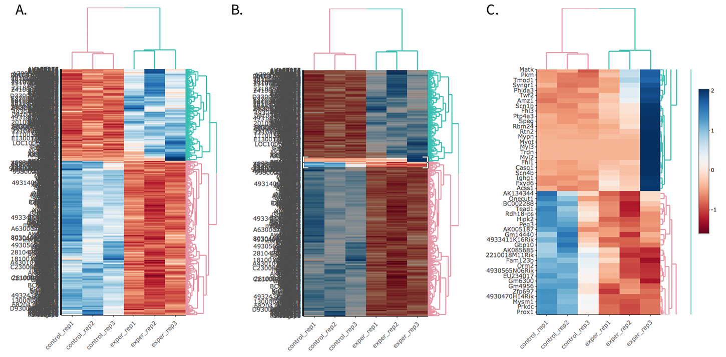
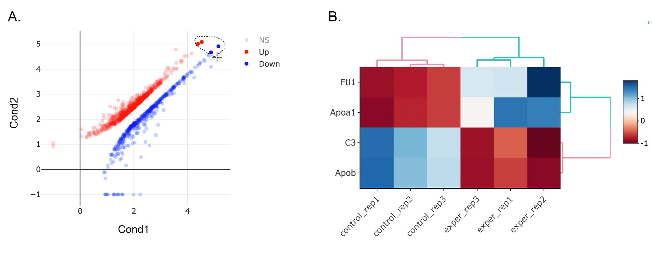
Once you've selected a specific region on Main Plots (Scatter, Volcano or MA plot), a new heatmap of the selected area will appear just next to your plot. If you want to hide some groups (such as Up, Down or NS based on DE analysis), just click on the group label on the top right part of the figure. In this way, you can select a specific part of the genes by lasso select or box select tools that includes only Up or Down Regulated genes. As soon as you completed your selection, heatmap will be created simultaneously.
A. Box Selection, B. Lasso Selection, C. Created heatmap based on selection
- We strongly recommend normalization before plotting heatmaps. To normalize, please change the parameters that are located under: Data options -> Normalization Methods and select the method from the dropdown box.
-
complete: Complete-linkage clustering is one of the linkage method used in hierarchical clustering. In each step of clustering, closest cluster pairs are always merged up to a specified distance threshold. Distance between clusters for complete link clustering is the maximum of the distances between the members of the clusters.
-
ward D2: Ward method aims to find compact and spherical clusters. The distance between two clusters is calculated by the sum of squared deviations from points to centroids. "ward.D2" method uses criterion (Murtagh and Legendre 2014) to minimize ward clustering method. The only difference ward.D2 and ward is the dissimilarities from ward method squared before cluster updating. This method tends to be sensitive to the outliers.
-
single: Distance between clusters for single linkage is the minimum of the distances between the members of the clusters.
-
average: Distance between clusters for average linkage is the average of the distances between the members of the clusters.
-
mcquitty: mcquitty linkage is when two clusters are joined, the distance of the new cluster to any other cluster is calculated by the average of the distances of the soon to be joined clusters to that other cluster.
-
median: This is a different averaging method that uses the median instead of the mean. It is used to reduce the effect of outliers.
-
centroid: The distance between cluster pairs is defined as the Euclidean distance between their centroids or means.
-
cor: 1 - cor(x) are used to define the dissimilarity between samples. It is less sensitive to the outliers and scaling.
-
euclidean: It is the most common use of distance. It is sensitive to the outliers and scaling. It is defined as the square root of the sum of the square differences between gene counts.
-
maximum: The maximum distance between two samples is the sum of the maximum expression value of the corresponding genes.
-
manhattan: The Manhattan distance between two samples is the sum of the differences of their corresponding genes.
-
canberra: Canberra distance is similar to the Manhattan distance and it is a special form of the Minkowski distance. The difference is that the absolute difference between the gene counts of the two genes is divided by the sum of the absolute counts prior to summing.
-
minkowsky: It is generalized form of euclidean distance.
You can also select to view an interactive version of the heatmap by clicking on the 'Interactive' checkbox on the left panel under the height and width options. Selecting this feature changes the heatmap into an interactive version with two colors, allowing you to select specific genes to be compared within the GO term plots.
Just like in the Main Plots, you can click and drag to create a selection. To select a specific portion of the heatmap, make sure to highlight the middle of the heatmap gene box in order to fully select a specific gene. This selection can be used later within the GO Term plots for specific queries on your selection.
A. Before Selection B. Selection of area with zoom tool C. Zoomed heatmap region which allows better viewing resolution.
Interactive Feature: In order to increase the performance of the generating heatmaps, interactive option is disabled by default. After deciding plotting/clustering parameters of the heatmap, you might activate this feature to investigate each block in detail.
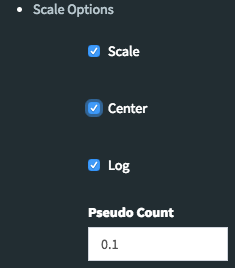
By using Scale Option field on the left sidebar menu, it is possible to adjust scaling parameters of DEBrowser. There are four main options:
- Center: If it is checked then centering is done by subtracting the column means of data from their corresponding columns. Otherwise no centering is done.(Default value:Checked)
- Scale: The value of scale determines how column scaling is performed (after centering). If scale is checked then scaling is done by dividing the (centered) columns of the data by their standard deviations if center is checked, and the root mean square if center is unchecked. If scale is unchecked, no scaling is done.(Default value:Checked)
- Log: The value of log determines the log2 operation of data matrix (Default value:Checked)
- Pseudo-Count: This value added to each element to prevent getting undefined (logarithm of zero) before calculation of log2(Default value:0.1)
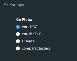
The next tab, 'GO Term', takes you to the ontology comparison portion of DEBrowser. From here you can select the standard dataset options such as p-adjust value, fold change cut off value, which comparison set to use, and which dataset to use on the left menu. In addition to these parameters, you also can choose from the 4 different ontology plot options: 'enrichGO', 'enrichKEGG', 'Disease', and 'compareCluster'. Selecting one of these plot options queries their specific databases with your current DESeq results.
Your GO plots include:
- enrichGO - use enriched GO terms
- enrichKEGG - use enriched KEGG terms
- Disease - enriched for diseases
- compareClusters - comparison of your clustered data
The types of plots you will be able to generate include:
Summary plot:
GOdotplot:
Changing the type of ontology to use will also produce custom parameters for that specific ontology at the bottom of the left option panel.
Once you have adjusted all of your parameters, you may hit the submit button in the top right and then wait for the results to show on screen!
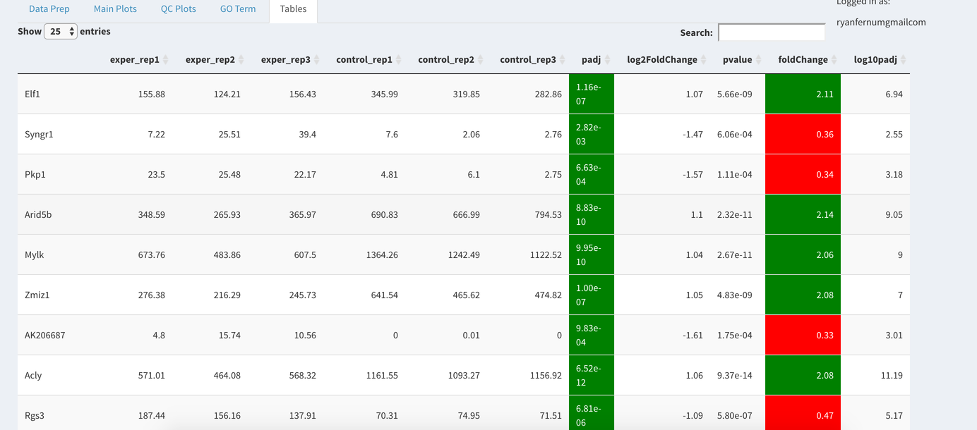
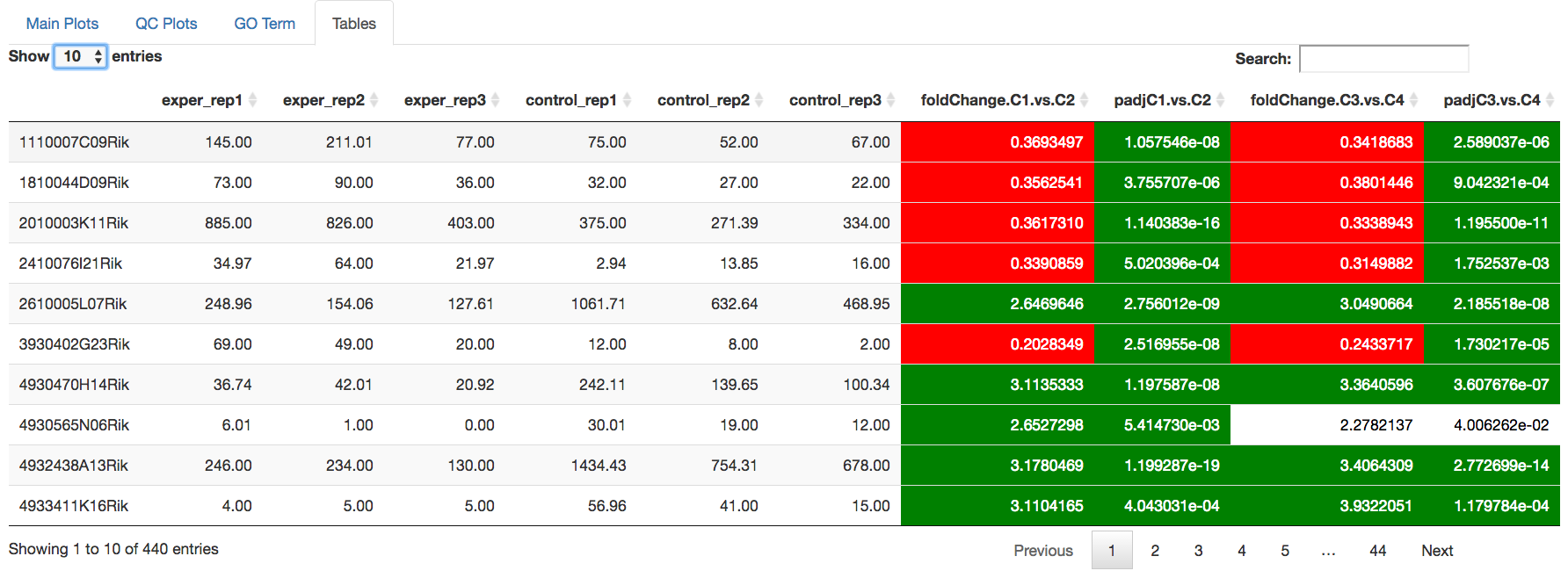
The last tab at the top of the screen displays various different data tables. These datatables include:
- All Detected
- Up Regulated
- Down Regulated
- Up+down Regulated
- Selected scatterplot points
- Most varied genes
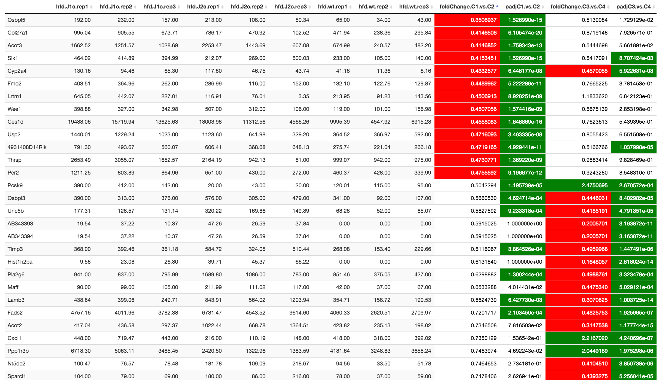
- Comparison differences
All of the tables tables, except the Comparisons table, contain the following information:
- ID - The specific gene ID
- Sample Names - The names of the samples given and they're corresponding tmm normalized counts
- Conditions - The log averaged values
- padj - padjusted value
- log2FoldChange - The Log2 fold change
- foldChange - The fold change
- log10padj - The log 10 padjusted value
The Comparisons table generates values based on the number of comparisons you have conducted. For each pairwise comparison, these values will be generated:
- Values for each sample used
- foldChange of comparison A vs B
- pvalue of comparison A vs B
- padj value of comparison A vs B
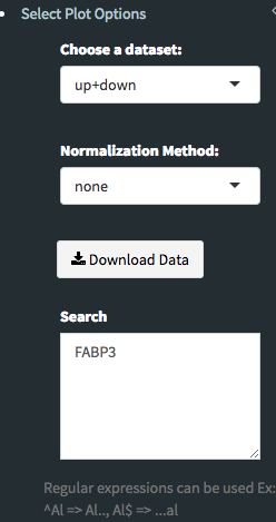
You can further customize and filter each specific table a multitude of ways. For unique table or dataset options, select the type of table dataset you would like to customize on the left panel under 'Choose a dataset' to view it's additional options. All of the tables have a built in search function at the top right of the table and you can further sort the table by column by clicking on the column header you wish to sort by. The 'Search' box on the left panel allows for multiple searches via a comma-separated list. You can additionally use regex terms such as "^al" or "*lm" for even more advanced searching. This search will be applied to wherever you are within DEBrowser, including both the plots and the tables.
- If you enter more than three lines of genes, search tool will automatically match the beginning and end of the search phrases. Otherwise it will find matched substrings in the gene list.
You can also view specific tables of your input data for each type of dataset available and search for a specific geneset by inputting a comma-separated list of genes or regex terms to search for in the search box within the left panel. To view these tables, you must select the tab labeled 'Tables' as well as the dataset from the dropdown menu on the left panel.
- If you ever want to change your parameters, or even add a new set of comparisons, you can always return to the Data Prep tab to change and resubmit your data.
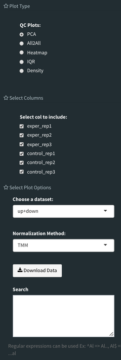
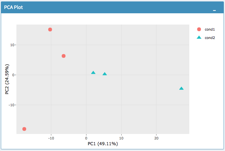
Selecting the 'QC Plots' tab will take you to the quality control plots section. The page opens with a Principal Component Analysis (PCA) plot and users can also view a All2All, heatmap, IQR, and density by choosing Plot Type in the left panel. Here the dataset being used in the plots, depends on the parameters you selected in the left panel. Therefore, you are able to adjust the size of the plots under 'width' and 'height' as well as alter a variety of other parameters to adjust the specific plot you're viewing.
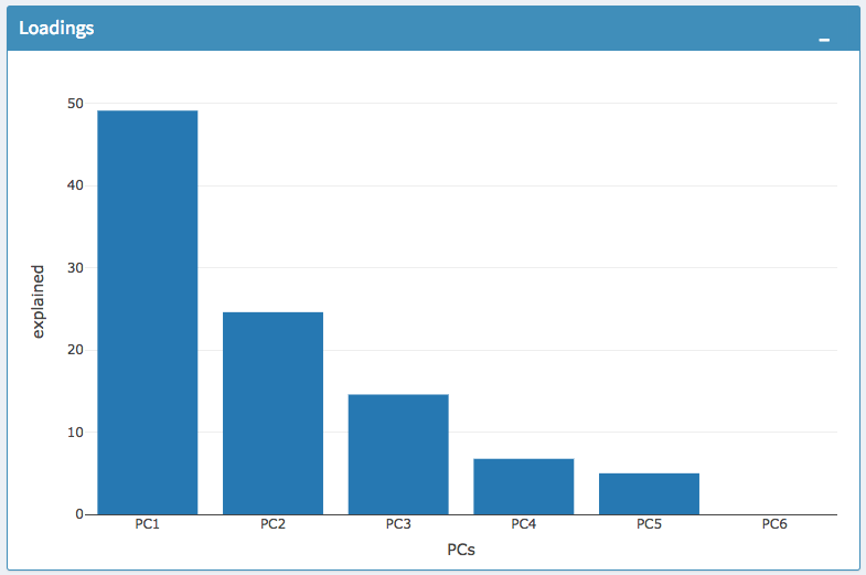
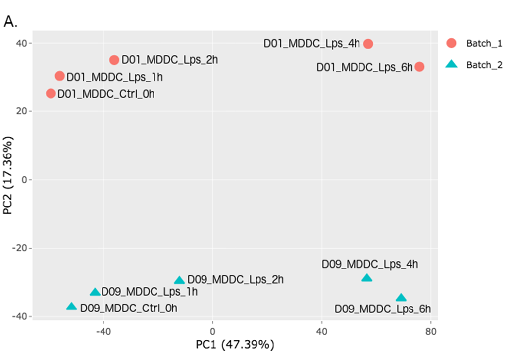
Principal Component Analysis (PCA) is excellent method of checking replicates. PCA calculates the variance between all of the samples genes within your current comparison set and creates a two-dimensional graph to represent the proportion of variance explained in different components. Within the PCA plot section you can select the p-adjust value, fold change cut off value, which comparison set to use, which dataset to use, the height and width of the corresponding plots, as well as which principal components to analyze by changing the appropriate values on the left menu.
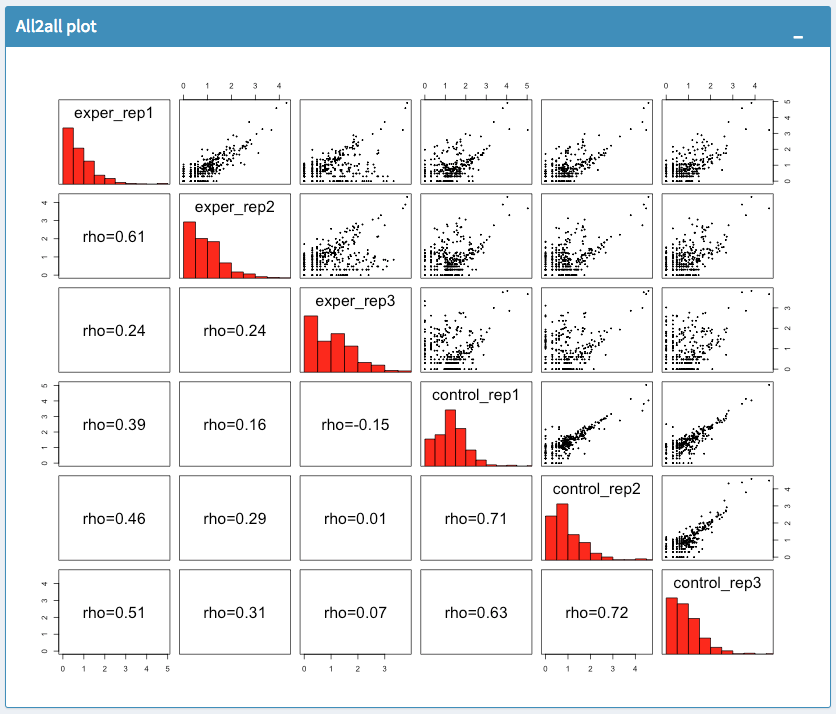
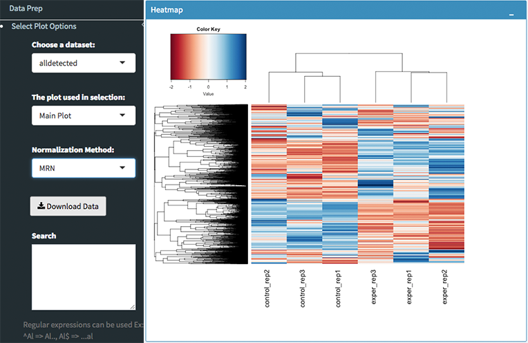
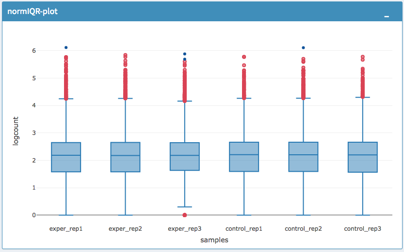
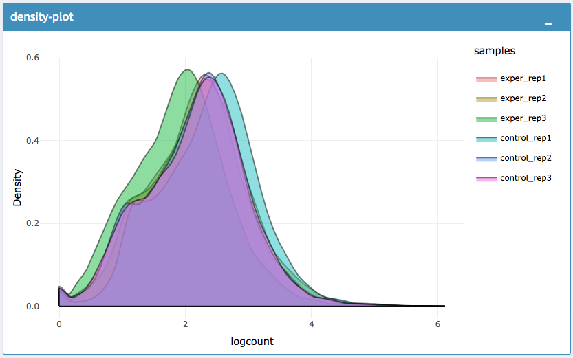
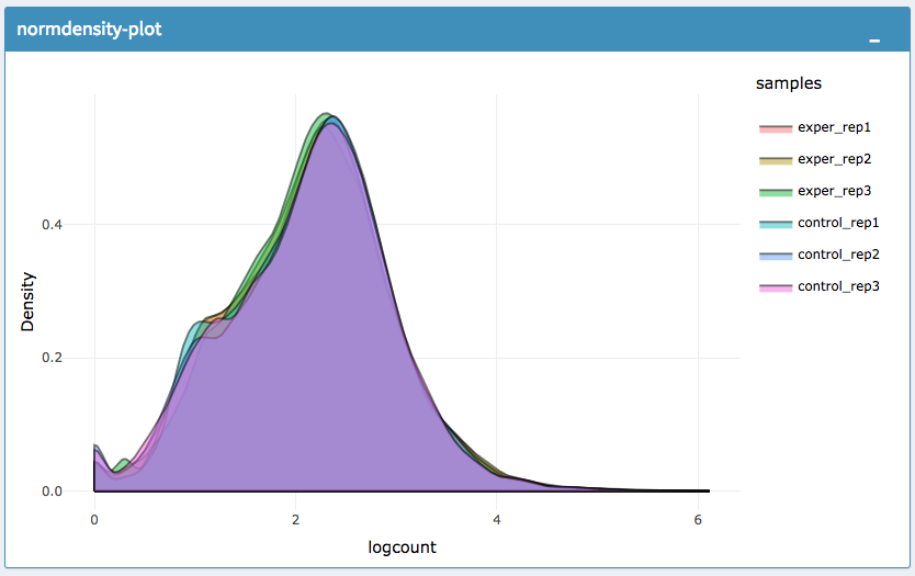
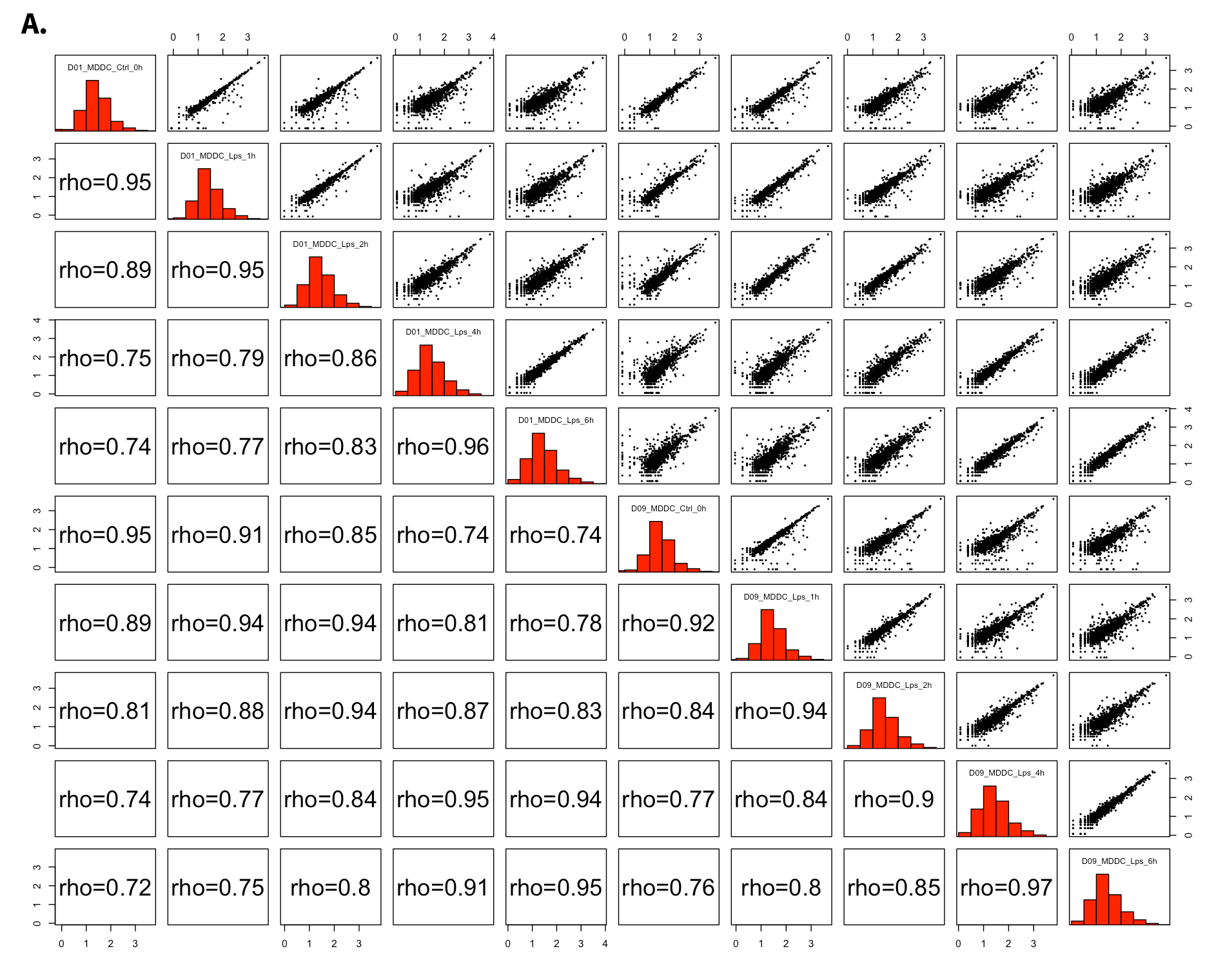
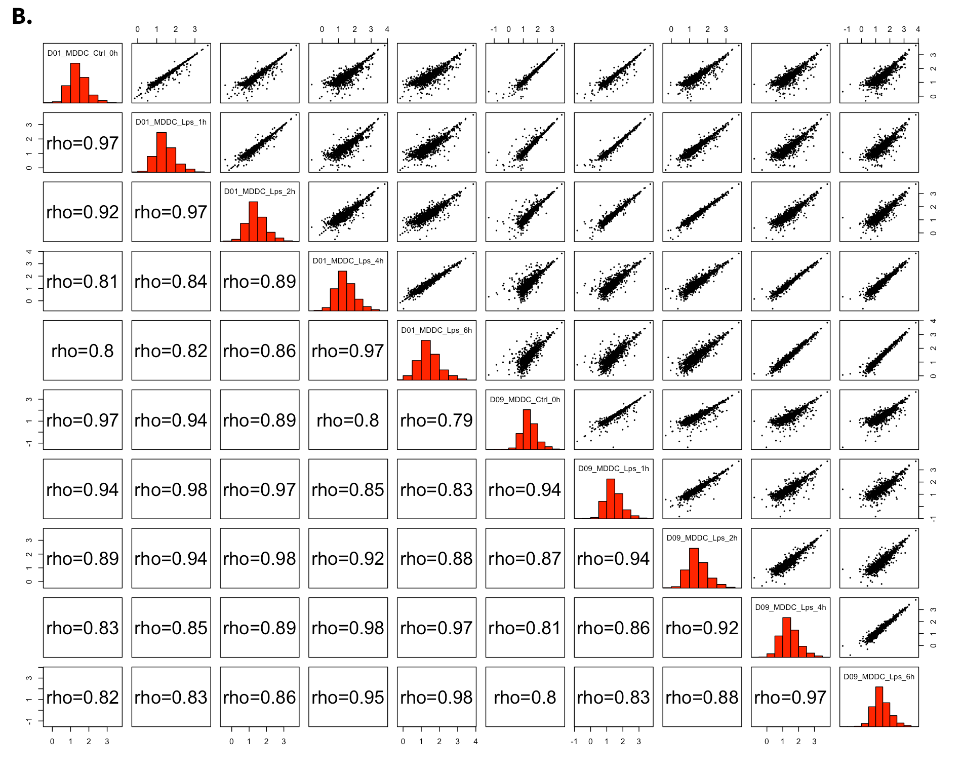
The All2All plot displays the correlation between each sample, Heatmap shows a heatmap representation of your data, IQR displays a barplot displaying the IQR between samples, and Density will display an overlapping density graph for each sample. You also have the ability to select the type of clustering and distance method for the heatmap produced to further customize your quality control measures. Users also have the option to select which type of normalization methods they would like to use for these specific plotting analysis within the left menu.
Ploting Options
All2All Plot
Heatmap Options to Normalize All Detected Data and Created Heatmap
PCA Plot
PCA Loadings
IQR Plot Before Normalization
IQR Plot After Normalization
Density Plot Before Normalization
Density Plot After Normalization
- Each QC plot also has options to adjust the plot height and width, as well as a download button for a png output located above each plot.
With that, you've now successfully navigated the DEBrowser and are ready to start inserting your own data files and browsing your own experiments. Enjoy the DEBrowser!
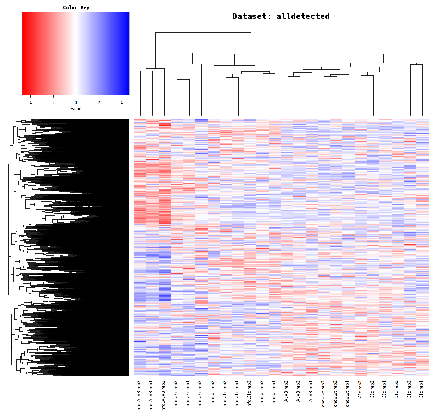
This guide is walkthrough for the preparation of figures which is used in DEBrowser paper. PCA, Heatmap, All2All will be plotted as an example for QC plots. Next, differential expression analysis will be conducted and their results will be visualized with Main plots such as Scatter, Volcano and MA. More detailed analysis will be covered by using simultaneously created Heatmap and KEGG pathway on the selected portion of the data.
- Upload Data: To begin the analysis, you need to load Demo Data by clicking Load Demo (Donnard et al)! button. Then click on Filter button to start Low Count Filtering.
- Low Count Filtering: Filtering method is selected as Max with cutoff 10 (which filter genes where maximum count for each gene across all samples are less than 10) and activated by clicking Filter button which is located at the center of the page. After filtration you can see the distribution of the data as shown at below. Now, you can proceed by clicking Batch Effect Correction button.
-
Batch Effect Correction and Normalization: Following options were selected to normalize the data:
- Normalization method: MRN
- Correction Method: None
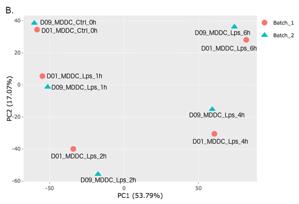
In order to adjust the appearance, use PCA controls which is located between two PCA plots.
- Text On/Off: On
- Select legend: color
- Color field: batch
- Shape field: batch
- All2All: After batch effect correction, you can click 'Go to QC plots!' to view quality control metrics on your data. The page opens with a Principal Component Analysis (PCA) plot. You can select All2All option from Plot type on the left sidebar menu. In order to get the figure as shown at below, you need to adjust other parameters of plot options on the left sidebar menu.
-
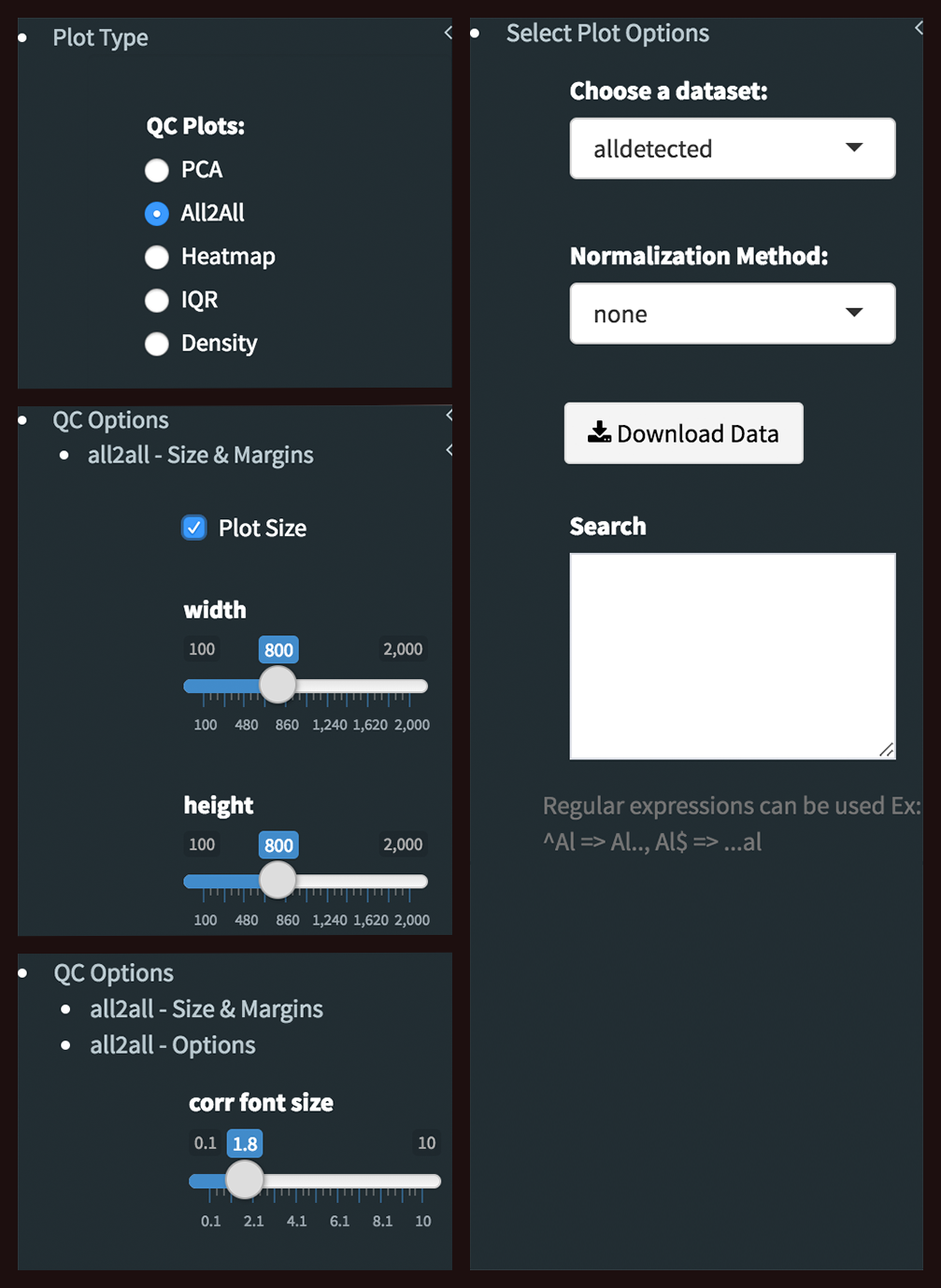
All2All - Plot Options: Following options are selected and their screenshots are shown at below.
- Plot Type: All2All
- Data Options: Choose a dataset: all-detected
- QC options - all2all - Size & Margins: Check the box of the Plot Size and adjust width and height as 800 and 800, respectively.
- QC options - all2all - Options: corr font size: 1.8 (adjust the font size of the text inside the box)
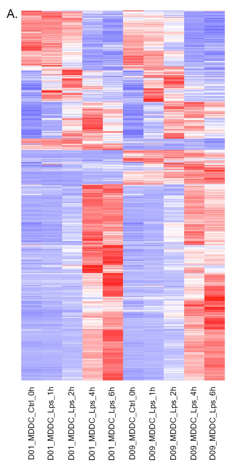
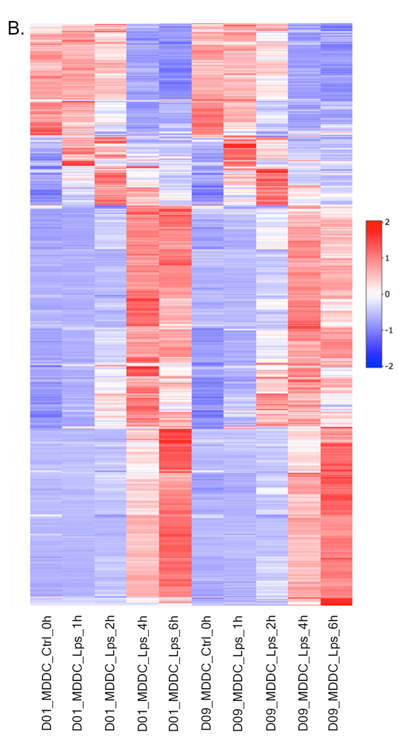
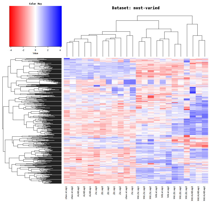
- Heatmap: To visualize heatmap as shown at below, please select Heatmap option from Plot type on the left sidebar menu and adjust plot options.
-
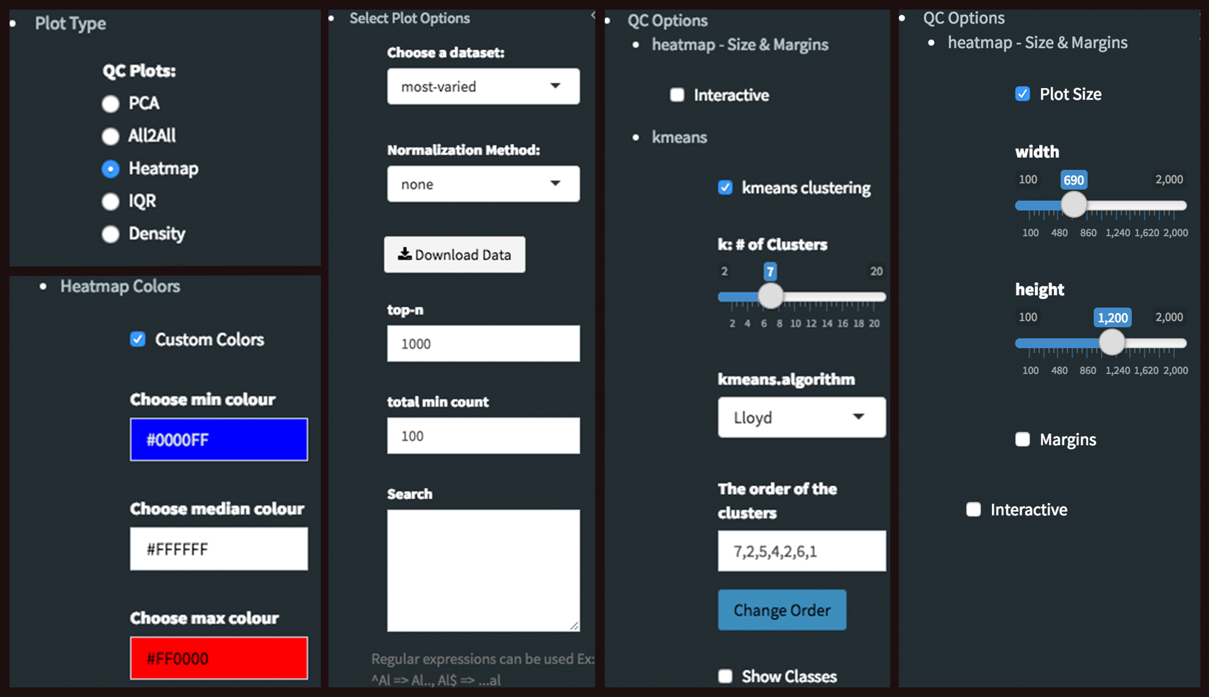
Heatmap - Plot Options: Similar to All2All plot, we need to adjust plotting options on the left sidebar menu.
- Plot Type: Heatmap
- Heatmap Colors: Check the box of custom colors.
- Data Options: Choose a dataset: most varied, top-n:1000, total min count:100 (to show the top 1000 most varied genes (based on coefficient of variance) whose total counts are higher than 100)
- QC options - kmeans: Check the box of kmeans clustering. Select 7 as # of clusters. You might need to change the order of the clusters and click change order button to get gradual changes on heatmap as in the figure.
- QC options - heatmap - Size & Margins: Check the box of the Plot Size and adjust width and height to 690 and 1200, respectively.
Since we finalized out plots without applying batch effect correction, we can return back to batch effect correction step and change the Correction Method as Combat and continue to create new graphs with the same parameters as we used before. To make it more user friendly, we are going to start explain these steps from the beginning. If you choose to continue from batch effect correction, please skip first two steps and continue reading from 3rd step: Batch Effect Correction and Normalization.
-
Upload Data: To begin the analysis, load Demo Data by clicking Load Demo (Donnard et al)! button. Then click on Filter button to start Low Count Filtering.
-
Low Count Filtering: Select Max method with cutoff 10 (which filter genes where maximum count for each gene across all samples are less than 10), then click Filter button which is located at the center of the page. After filtration, proceed to next step by clicking Batch Effect Correction button.
-
Batch Effect Correction and Normalization: Following options were selected to apply both normalization and batch effect correction:
- Normalization method: MRN
- Correction Method: Combat
- Treatment: treatment
- Batch: batch
-
Please adjust PCA controls (which is located between two PCA plots) as listed below:
- Text On/Off: On
- Select legend: color
- Color field: batch
- Shape field: batch
- All2All: After batch effect correction, click 'Go to QC plots!' and select All2All option from Plot type on the left sidebar menu. Please adjust All2All - Plot Options as listed below.
-
All2All - Plot Options:
- Plot Type: All2All
- Data Options: Choose a dataset: all-detected
- QC options - all2all - Size & Margins: Check the box of the Plot Size and adjust width and height to 800 and 800, respectively.
- QC options - all2all - Options: corr font size: 1.8
- Heatmap: Please select Heatmap option from Plot type on the left sidebar menu and adjust plot options according to the list below.
-
Heatmap - Plot Options:
- Plot Type: Heatmap
- Heatmap Colors: Check the box of custom colors.
- Data Options: Choose a dataset: most varied, top-n:1000, total min count:100 (to show the top 1000 most varied genes (based on coefficient of variance) whose total counts are higher than 100)
- QC options - kmeans: Check the box of kmeans clustering. Select 7 as # of clusters. You might need to change the order of the clusters and click change order button to get gradual changes on heatmap as in the figure.
- QC options - heatmap - Size & Margins: Check the box of the Plot Size and adjust width and height to 690 and 1200, respectively.
-
Upload Data: To begin the analysis, load Count Data by clicking Load Demo (Vernia et. al)! button. Then click on Filter button to start Low Count Filtering.
-
Low Count Filtering: Select Max method with cutoff 10 (which filter genes where maximum count for each gene across all samples are less than 10), then click Filter button which is located at the center of the page. Proceed to next step by clicking Batch Effect Correction button.
-
Batch Effect Correction and Normalization: We are going to skip both normalization and batch effect correction by selecting following options:
- Normalization method: None
- Correction Method: None
-
DE Analysis: After batch effect correction, click 'Go to DE Analysis'. In this page, we will add groups for comparison. Click on Add New Comparison button and select Select Meta as treatment. It will automatically separate experiment and control data into two groups. You can leave other parameters as default as listed below and click "Submit" button.
- DE method: DESeq2
- Fit Type: parametric
- betaPrior: FALSE
- Test Type: Wald
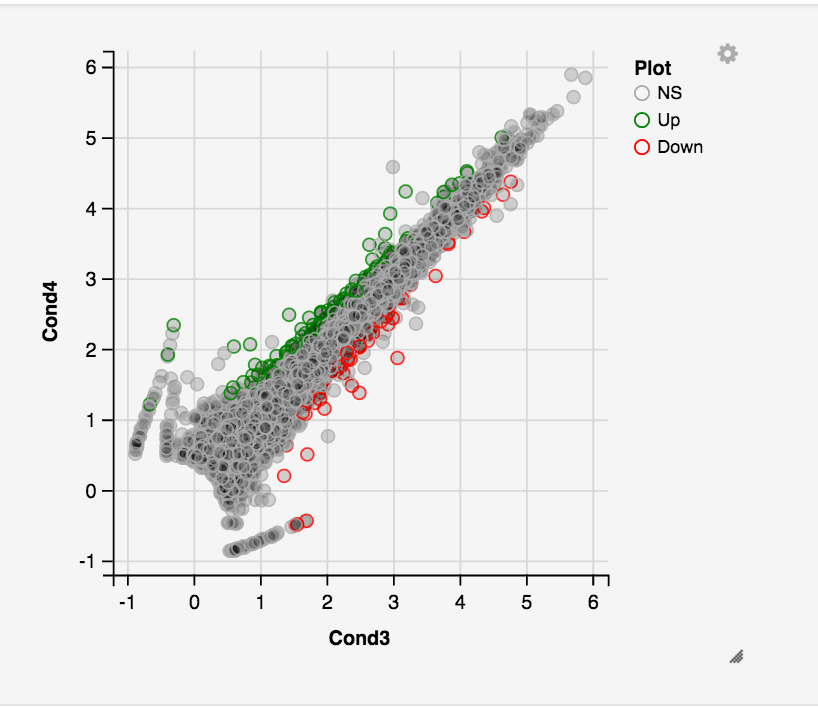
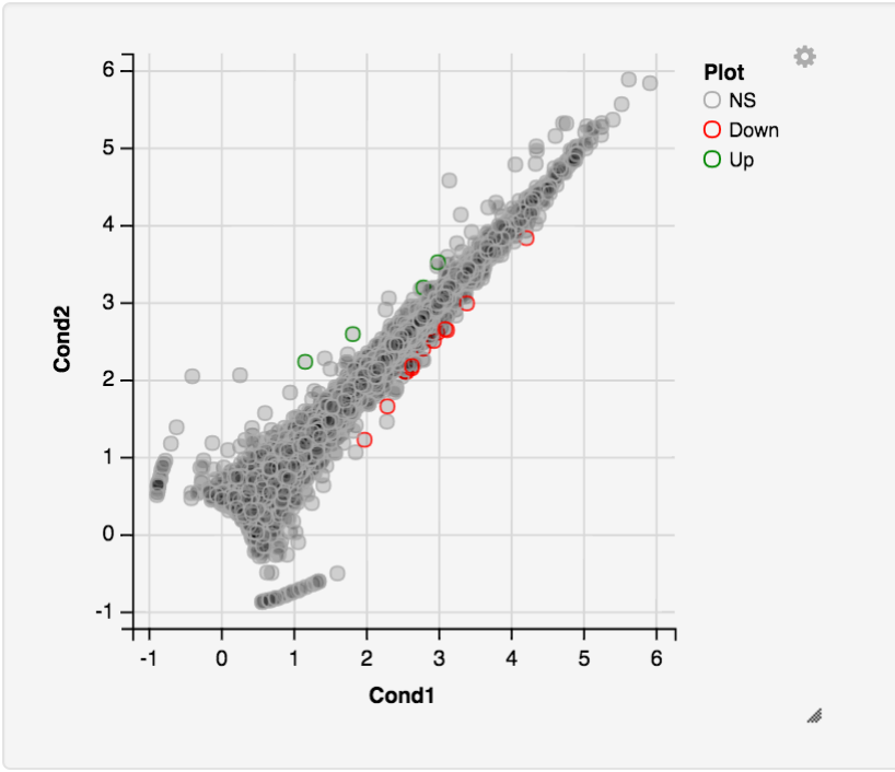
- Main Plots Analysis: Upon finishing the DESeq analysis, you will see DE Results in table format. Please click on Go to Main Plots! button which will open Scatter Plot. You can switch to Volcano Plot and MA Plot by using Plot Type section at the left side of the menu. Since these plots are interactive, you can click to zoom button on the top of the graph and select the area you would like to zoom in by drawing a rectangle. Please see the plots at below:
Please keep in mind that to increase the performance of the generating graph, by default 10% of non-significant(NS) genes are used to generate plots. We used all of the NS genes in our plots that showed above, therefore please click Main Options button and change Background Data(%) to 100% on the left sidebar.
- Read count plots: Lets return back to Scatter Plot by using Plot Type section. You can hover on each point on the graph to see their read counts as a bar graph as shown at below. In this example FABP3 is selected to show the high variance of this gene across samples.
If you want to mark FABP3 gene on the plot, click on Data Options and enter FABP3 in to the search field as showed below. You will see green mark on the plot that shows FABP3.
- Lasso selection: DEBrowser can draw heatmaps of any selected region of any main plot. Selection can be made in a rectangular form or as a free-form using plotly’s lasso select. To do so, first click NS label at the upper right side of the figure, and hide non-significant genes. Then click on lasso select button at the top of the plot and select the genes you're interested as shown at below. Heatmap will appear just next to scatter plot. Additionally, you can activate interactive mapping option for heatmap by clicking Interactive button under Heatmap Options on the left sidebar menu. Now, you can hover on each block of heatmap to see gene name and its value.
Interactive Feature: In order to increase the performance of the generating heatmaps, interactive option is disabled by default. After deciding plotting/clustering parameters of the heatmap, you might activate this feature to investigate each block in detail.
-
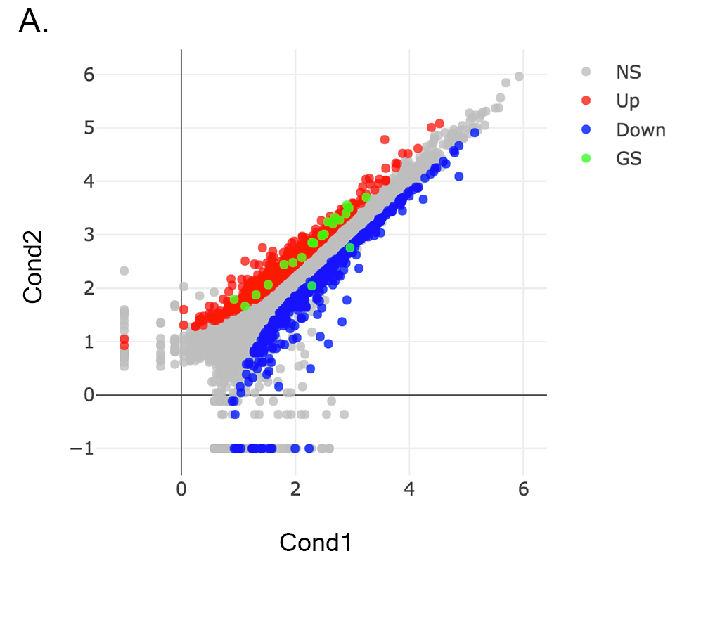
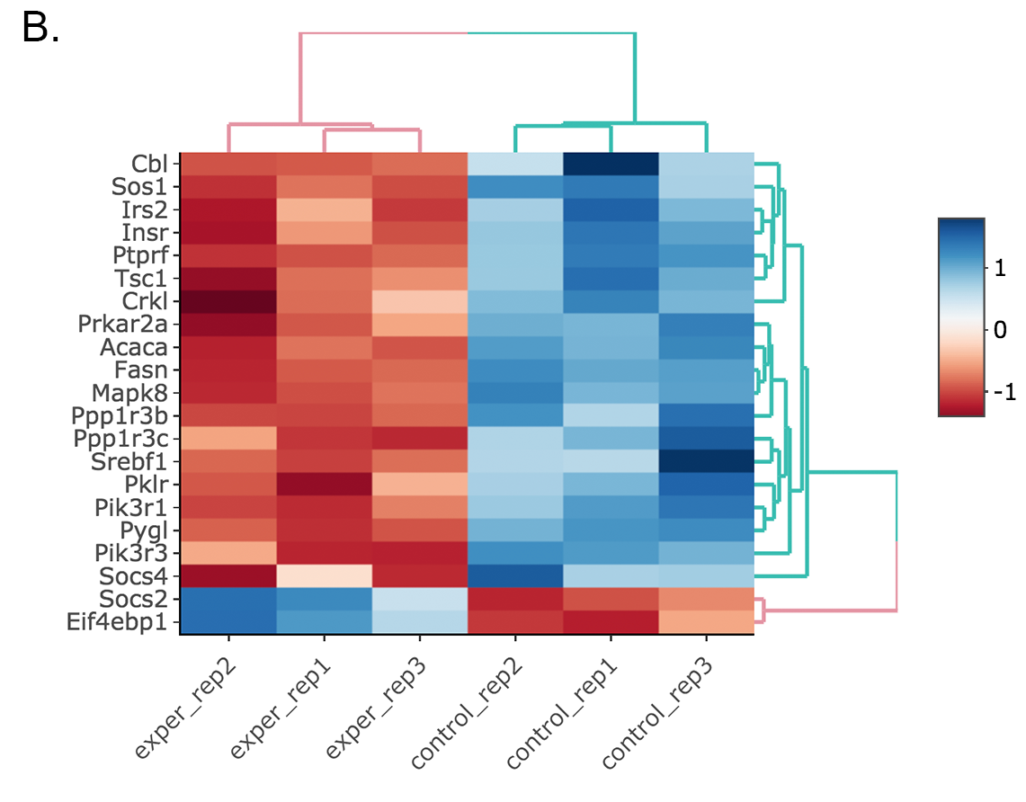
Scatter plot of the genes enriched in insulin signaling pathway: In this example, we will highlight genes enriched in insulin signaling pathway. If you already hid NS genes, you can show them by clicking on the NS label at the upper right side of the figure. Click on the Data Options and enter following genes in to the search field:
 Cbl
 Sos1
 Irs2
 Insr
 Ptprf
 Tsc1
 Crkl
 Prkar2a
 Acaca
 Fasn
 Mapk8
 Ppp1r3b
 Ppp1r3c
 Srebf1
 Pklr
 Pik3r1
 Pygl
 Pik3r3
 Socs4
 Socs2
 Eif4ebp1
- If you enter more than three lines of genes, search tool will automatically match the beginning and end of the search phrases. Otherwise it will find matched substrings in the gene list.
Now, you will see green marks on the searched genes as shown below:
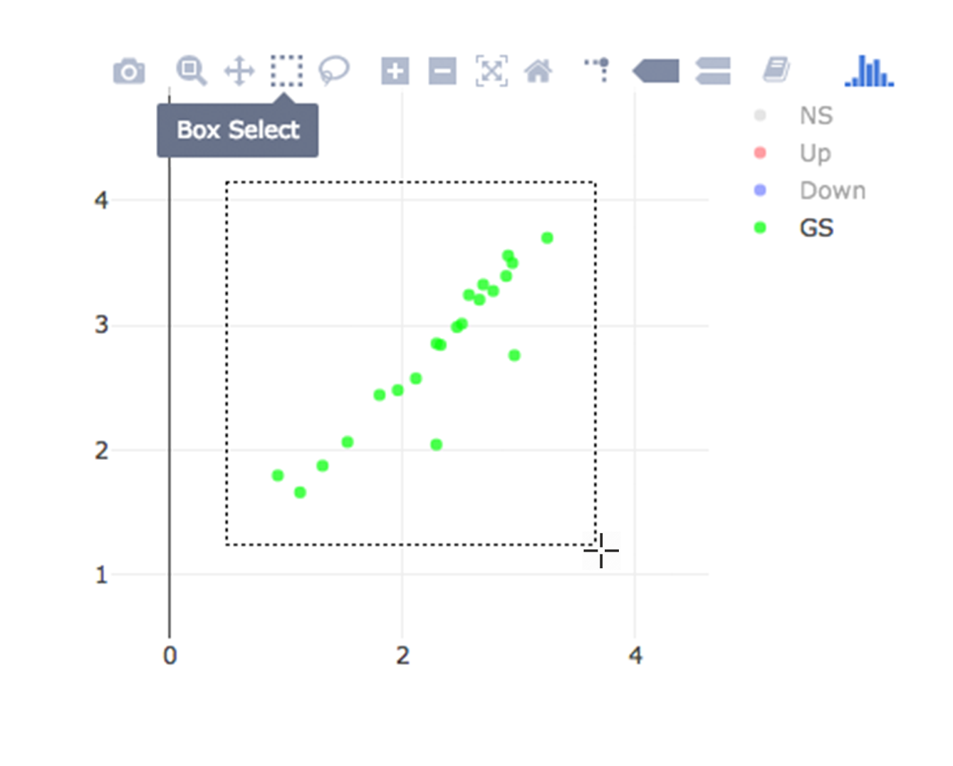
Lets, hide all the genes other then searched genes by clicking NS, Up and Down labels at the upper right side of the figure. Since only the selected genes are left on the graph, we can select these genes by clicking on Select Box icon and drawing a rectangle which covers all of these genes.
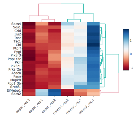
Here as shown below, heatmap will be simultaneously created just next to scatter plot. You might need to change plot margins as following:
- Heatmap options -> heatmap - Size & Margins: Please check the box of the Plot Size and adjust width and height to 580 and 500, respectively.
Since the data is not normalized, data of exper_rep3 looks like it belongs to control group. We strongly recommend normalization before plotting subset of genes. To normalize, please change the parameters as described below and see the updated figure at below:
- Data options -> Normalization Methods: Please select MRN from the dropdown box.
Activating Interactive feature transforms the heatmap into an interactive version with two colors, allowing you to select specific genes to be compared within the GO term plots.
-
Upload Data: To begin the analysis, download full dataset (Vernia et. al) https://umms.dolphinnext.com/pub/debrowser/advanced_demo.tsv and full metadata https://umms.dolphinnext.com/pub/debrowser/advanced_meta.tsv on your computer. Then click browse button, and select downloaded files from your computer. Please keep Separator as Tab while this processes. Finally click upload button to see Upload Summary. Now you can click on Filter button to start Low Count Filtering.
-
Low Count Filtering: Select Max method with cutoff 10 (which filter genes where maximum count for each gene across all samples are less than 10), then click Filter button which is located at the center of the page. We are going to skip normalization and batch effect correction step by clicking 'Go to DE Analysis' button.
-
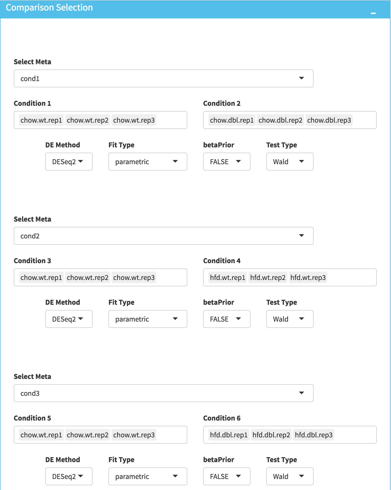
DE Analysis: In this page, we will add multiple groups for comparison. Click on Add New Comparison button and select Select Meta as Cond1. Repeat this step for Cond2 and Cond3 and add two more comparisons. It will automatically separate experiment and control data into two groups. You can leave other parameters as default as listed below and click "Submit" button.
- DE method: DESeq2
- Fit Type: parametric
- betaPrior: FALSE
- Test Type: Wald
-
Downloading fold2Change data of selected genes: Upon finishing the DE analysis, you will see DE Results in table format. Please click on Go to Main Plots! button which will open Scatter Plot. On the left sidebar menu, click *Data options tab and enter following genes regarding to PPARα pathway:
 Cyp4a12b
 Cyp4a14
 Ehhadh
 Cyp8b1
 Cpt1b
 Cyp7b1
 Slc27a1
 Apoa5
 Pdpk1
 Apoa1
 Acadl
 Fads2
 Fabp4
 Acadm
 Apoa2
 Apoc3
 Fgf21
 Fabp5
 Fabp3
 Lpl
 Dbi
 Nr1h3
 Fabp7
 Ppara
 Ucp1
 Sdc1
 Sdc3
 Sdc2
 Fabp2
Afterwards, select comparison option for the Choose a dataset field. This option will add fold change columns to to our data.
Now, we need to disable filtration to get all searched genes in our dataset. To do so, enter following parameters into Filter field on the left sidebar menu.
* **padj:** 1
* **foldChange:** 1
To confirm you can check all adjusted parameters at image below.
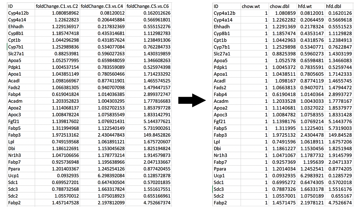
It is time to download our dataset by clicking Download Data button on the Data Options field. You can open downloaded tsv file in Excel or similar programs. Once you open the file, you will see columns of count data, padj and fold2Change for all comparisons. Since we are only interested in fold2Change columns, you can delete the rest. Final data file should look like image on the left at below.
We will rename column names as follows and add new column called chow.wt which compares chow.wildtype with itself therefore it is filled with 1.
* **foldChange.C1.vs.C2** to chow.dbl
* **foldChange.C3.vs.C4** to hfd.wt
* **foldChange.C5.vs.C6** to hfd.dbl
To confirm you can also download the final version of the fold2data from this link: https://umms.dolphinnext.com/pub/debrowser/comparisons.tsv
-
Creating Heatmap for fold2change data: To create heatmap for fold change data, you have two options: A. Using startHeatmap() function or B. Use DEBrowser Heatmap module.
-
A. Open new R session and run following command in R or R Studio to run Heatmap module in web browser:
startHeatmap()
Similar to DEBrowser, you can click browse button, and select prepared log2change file from your computer. Please keep Separator as Tab. Finally click upload button to see Upload Summary.
-
B. Open new R session and run following command in R or R Studio to load dataset as data frame (comparisons)::
comparisons <- read.delim("~/Downloads/comparisons.tsv", row.names=1)
You may need to change the path of the file according to your folder structure. Now, in order to open heatmap module, you need to run following script:
library(debrowser) library(DESeq2) library(heatmaply) library(RColorBrewer) library(gplots) options(warn=-1) header <- dashboardHeader(title = "DEBrowser Heatmap") sidebar <- dashboardSidebar( getJSLine(), sidebarMenu(id="DataAssessment", menuItem("Heatmap", tabName = "Heatmap"), plotSizeMarginsUI("heatmap"), heatmapControlsUI("heatmap"))) body <- dashboardBody( tabItems( tabItem(tabName="Heatmap", getHeatmapUI("heatmap"), column(4, verbatimTextOutput("heatmap_hover"), verbatimTextOutput("heatmap_selected") ) ) )) ui <- dashboardPage(header, sidebar, body, skin = "blue") server <- function(input, output, session) { selected <- reactiveVal() observe({ withProgress(message = 'Creating plot', style = "notification", value = 0.1, { selected(callModule(debrowserheatmap, "heatmap", comparisons)) }) }) output$heatmap_hover <- renderPrint({ if (!is.null(selected()) && !is.null(selected()$shgClicked()) && selected()$shgClicked() != "") return(paste0("Clicked: ",selected()$shgClicked())) else return(paste0("Hovered:", selected()$shg())) }) output$heatmap_selected <- renderPrint({ if (!is.null(selected())) selected()$selGenes() }) } shinyApp(ui, server) -
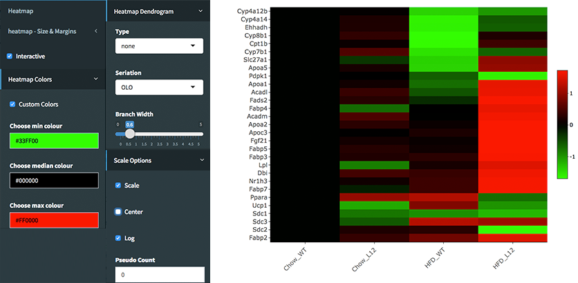
Shiny will launch a web browser which is ready to use as a heatmap module. You need to specify following parameters to create log2fold change graph:
* **Interactive:** Checked
* **Custom Colors:** Checked
* **Custom Colors -> Choose min colour:** #33FF00
* **Custom Colors -> Choose median colour:** #000000
* **Custom Colors -> Choose max colour:** #FF0000
* **Heatmap Dendrogram -> Type:** none
* **Scale Options -> Scale:** Checked
* **Scale Options -> Center:** Unchecked
* **Scale Options -> Log:** Checked
* **Scale Options -> Pseudo Count:** 0
Once you specify these parameters, your heatmap will be seen as image at below.
Taking a look at the case study (Vernia S. et al 2014), Multiple heatmaps were created to display findings within the research. The heatmaps generated for the study were customized to a high level of specificity. However, using a sample dataset generated from this study, it is possible to recreate similar heatmaps (Figure 31-32) displayed within the studies findings.
The main difference between the heatmaps created within DEBrowser and the heatmaps created within the research paper is that the clustering method used within the paper was a k-means method with k equaling 6.
The JNK2 Knock-out versus JNK1 Knock-out:
High fat diet JNK1 knock-out and JNK2 knock-out samples compared against high fat
diet wild type samples showed a stronger effect from JNK2 KO.
From the figures below, JNK2 KO has a
stronger effect than JNK1 KO samples. There are 177 genes (Figure 33) that have
padj < 0.01 and |log2 foldchange| > 1 in the JNK2 KO comparison while there are
only 17 genes (Figure 34) detected in the JNK1 KO comparison with the same cutoffs.
JNK1 and JNK2 serve partially redundant functions:
High fat diet JNK1 and High fat diet JNK2 double KO has 1018 significantly different genes. When we compare HFD JNK1 KO only (177 Genes) and HFD JNK2 KO only (17 genes) with HFD wild type side-by-side, most of the up and down regulated genes are not overlapping. Up regulated genes (Figure 35.) and down regulated (Figure 36.) in JNK1 KO was easy to analyze for these gene comparisons. There is only 1 gene overlapping out of the 17 that were significantly different in JNK1 KO comparisons with padj < 0.01 and |log2foldchange| > 1 cutoffs. It shows that both individual KO might have individual functions in addition to their redundant functions. When we looked at the genes in JNK1 KO in the KEGG database, they are enriched in "Fatty acid elongation”. JNK2 KO are enriched in "PPAR signaling pathway” and "Biosynthesis of unsaturated fatty acids”. DEBrowser’s powerful comparison function makes different condition comparisons and running GO Term analysis on selected genes much easier.
Comparing the HFD wild type and the normal chow wild type also shows significant differences between regulated genes (Figure 37). Expanding on the analysis further, the upregulated genes analyzed are then compared to KEGG and Disease ontologies to show a variety of metabolism related correlations (Figures 38-39).
Using the 'advanced demo' dataset we mentioned earlier, you too can recreate these tables using the same data. Browsing, changing parameters, and creating unique plots to view and analyze data can be a creative way to recreate the same analytical results produced. DEBrowser can be used in multiple ways to check the reproducibility of research results in a highly interactive format!
DEBrowser vs other Differential Expression analysis software:
The comparison table (Figure 40) displays multiple comparisons between debrowser and other various methods of viewing Differential Expression Analysis results.
Some of the comparisons can be viewed either within the tool itself or within some of the figures provided. A multiple tool comparison can be observed within figure 34, an interactive visualization of gene highlighting can be observed for figures 12-14, and an interactive visualization of biological variation or condition comparisons can also be observed for figure 34.
For more information on MeV (Howe et al., 2011) please visit this link: MeV
For more information about Chipster (Kallio et al., 2011), please visit this link: Chipster
For more information about Galaxy (Giardine et al., 2005), please visit this link: Galaxy
For more information about CummeRBund (Trapnell et al., 2012), please visit this link: CummeRbund
On Fedora/Red Hat/CentOS, these packages have to be installed:
openssl-devel, libxml2-devel, libcurl-devel, libpng-devel
On Ubuntu 18.04 LTS, you can install required packages by following command:
sudo apt-get install libcurl4-openssl-dev libssl-dev libv8-3.14-dev udunits-bin libudunits2-* libxml2-dev
DEBrowser also accepts JSON files via hyperlink.
1. jsonobject=https://umms.dolphinnext.com/pub/debrowser/advanced_demo_org.json
Now this link can be used in debrowser as::
https://debrowser.umassmed.edu/?jsonobject=https://umms.dolphinnext.com/pub/debrowser/advanced_demo_org.json
If you'd like to add metadata::
2. meta=https://umms.dolphinnext.com/pub/debrowser/advanced_meta.json

https://debrowser.umassmed.edu/?jsonobject=https://umms.dolphinnext.com/pub/debrowser/advanced_demo_org.json&meta=https://umms.dolphinnext.com/pub/debrowser/advanced_meta.json
Inputting this URL into your browser will automatically load in that tsv to be analyzed by DEBrowser!
-
Anders,S. et al. (2014) HTSeq - A Python framework to work with high-throughput sequencing data.
-
Chang,W. et al. (2016) shiny: Web Application Framework for R.
-
Chang,W. and Wickham,H. (2015) ggvis: Interactive Grammar of Graphics.
-
Giardine,B. et al. (2005) Galaxy: a platform for interactive large-scale genome analysis. Genome Res., 15, 1451–1455.
-
Howe,E.A. et al. (2011) RNA-Seq analysis in MeV. Bioinformatics, 27, 3209–3210.
-
Kallio,M.A. et al. (2011) Chipster: user-friendly analysis software for microarray and other high-throughput data. BMC Genomics, 12, 507.
-
Li,B. and Dewey,C.N. (2011) RSEM: accurate transcript quantification from RNA-Seq data with or without a reference genome. BMC Bioinformatics, 12, 323.
-
Love,M.I. et al. (2014) Moderated estimation of fold change and dispersion for RNA-seq data with DESeq2. Genome Biol., 15, 550.
-
Reese,S.E. et al. (2013) A new statistic for identifying batch effects in high-throughput genomic data that uses guided principal component analysis. Bioinformatics, 29, 2877–2883.
-
Reich,M. et al. (2006) GenePattern 2.0. Nat. Genet., 38, 500–501.
-
Risso,D. et al. (2014) Normalization of RNA-seq data using factor analysis of control genes or samples. Nat. Biotechnol., 32, 896–902.
-
Ritchie,M.E. et al. (2015) limma powers differential expression analyses for RNA-sequencing and microarray studies. Nucleic Acids Res., 43, e47–e47.
-
Trapnell,C. et al. (2012) Differential gene and transcript expression analysis of RNA-seq experiments with TopHat and Cufflinks. Nat. Protoc., 7, 562–578.
-
Vernia,S. et al. (2014) The PPAR$\alpha$-FGF21 hormone axis contributes to metabolic regulation by the hepatic JNK signaling pathway. Cell Metab., 20, 512–525.
-
Murtagh, Fionn and Legendre, Pierre (2014). Ward's hierarchical agglomerative clustering method: which algorithms implement Ward's criterion? Journal of Classification 31 (forthcoming).
-
Johnson et al. (2007) Adjusting batch effects in microarray expression data using empirical Bayes methods. Biostatistics, 8, 118-127.
